

You may be interested in…

.
Cart will be automatically cleared after 48 hours of no activity.
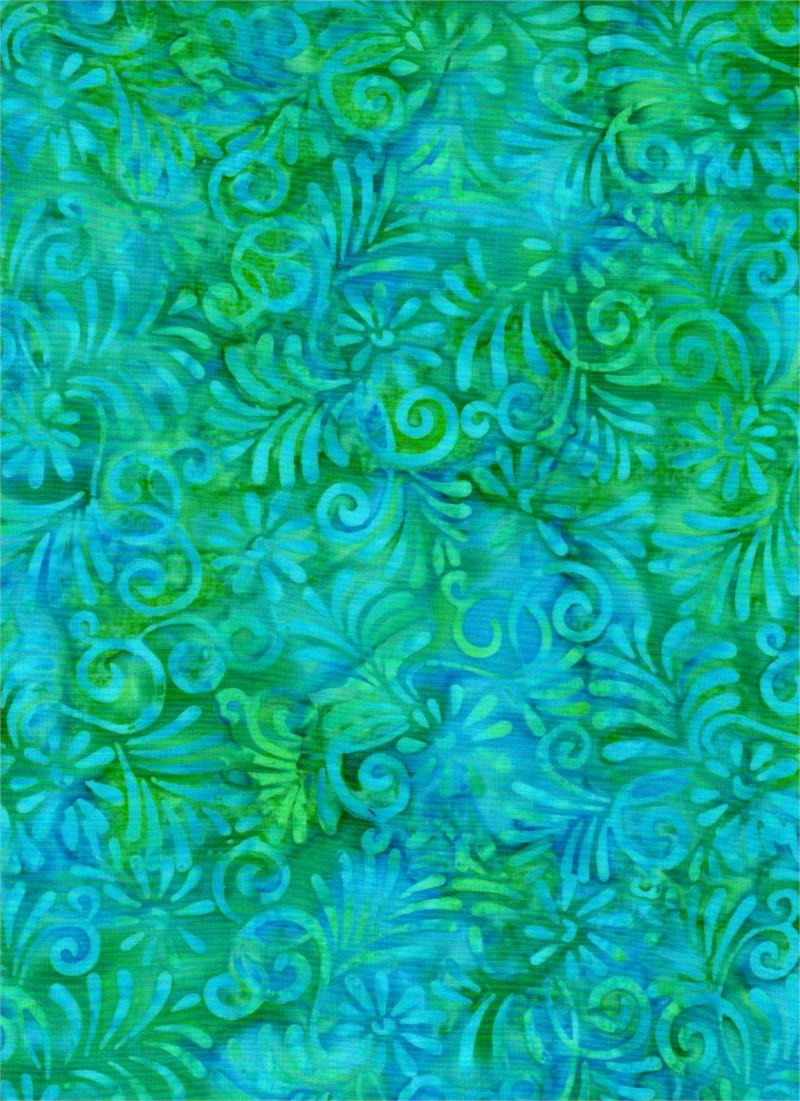 Batik Textiles - 4224 - Blue Green Leaf - Remnants of Summer - Fabric
1 × $11.60
Batik Textiles - 4224 - Blue Green Leaf - Remnants of Summer - Fabric
1 × $11.60 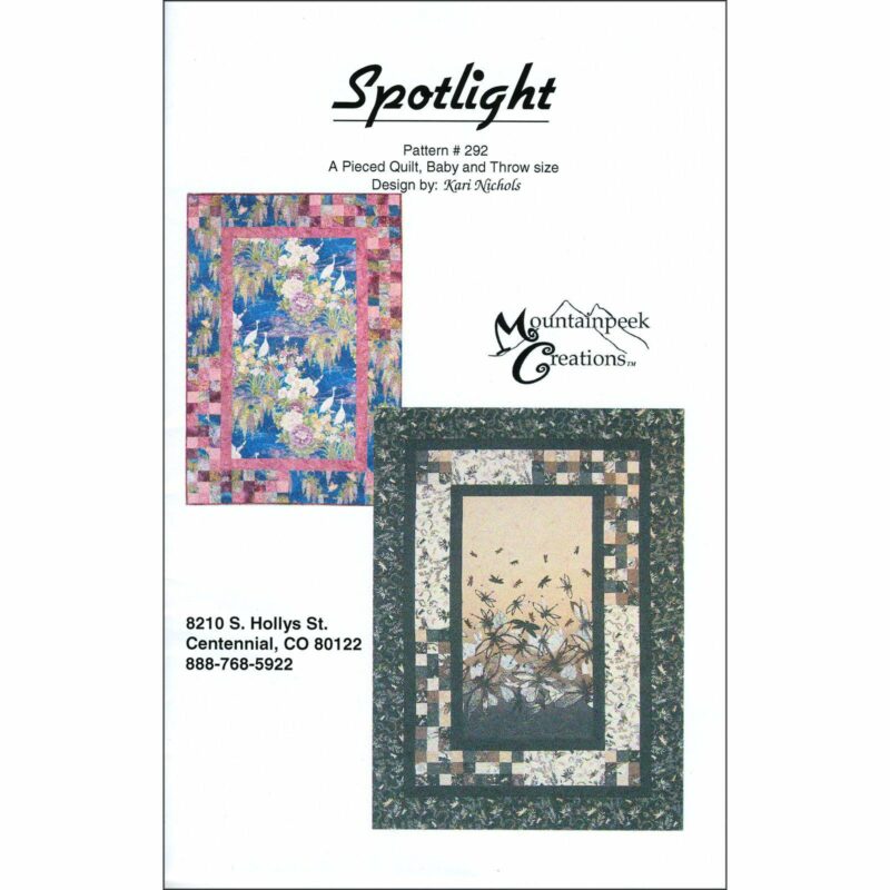 Spotlight Quilt Pattern - Mountainpeek Creations - Kari Nichols
1 × $9.00
Spotlight Quilt Pattern - Mountainpeek Creations - Kari Nichols
1 × $9.00 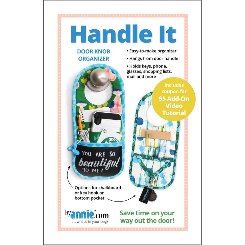 Handle It - Sewing Pattern - Byannie.com - Door Knob Organizer - Easy to Make
1 × $9.00
Handle It - Sewing Pattern - Byannie.com - Door Knob Organizer - Easy to Make
1 × $9.00 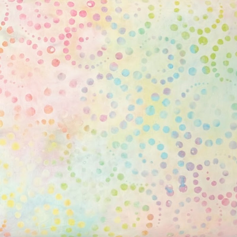 Batik Textiles - 4227 - Pastel Swirling Dots - Remnants of Summer Fabric
2 × $12.20
Batik Textiles - 4227 - Pastel Swirling Dots - Remnants of Summer Fabric
2 × $12.20 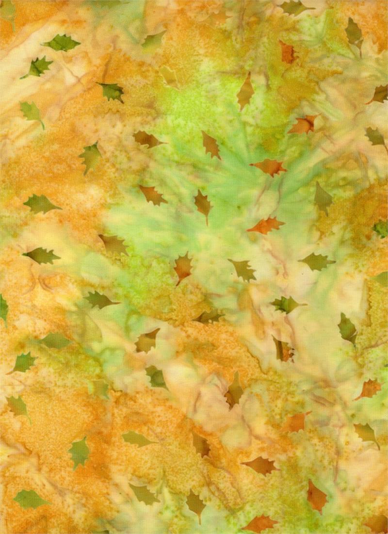 Batik Textiles - 4321 - Gold Yellow Green Orange Leaves - Venus, Cattails, and Moon Bayou Fabric
3 × $11.40
Batik Textiles - 4321 - Gold Yellow Green Orange Leaves - Venus, Cattails, and Moon Bayou Fabric
3 × $11.40 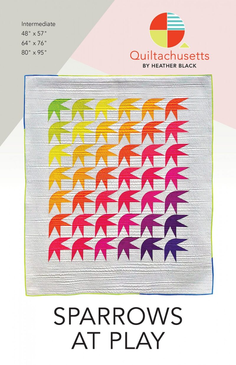 Sparrows at Play Quilt Pattern - Quiltachesettes - Heather Black
1 × $10.00
Sparrows at Play Quilt Pattern - Quiltachesettes - Heather Black
1 × $10.00 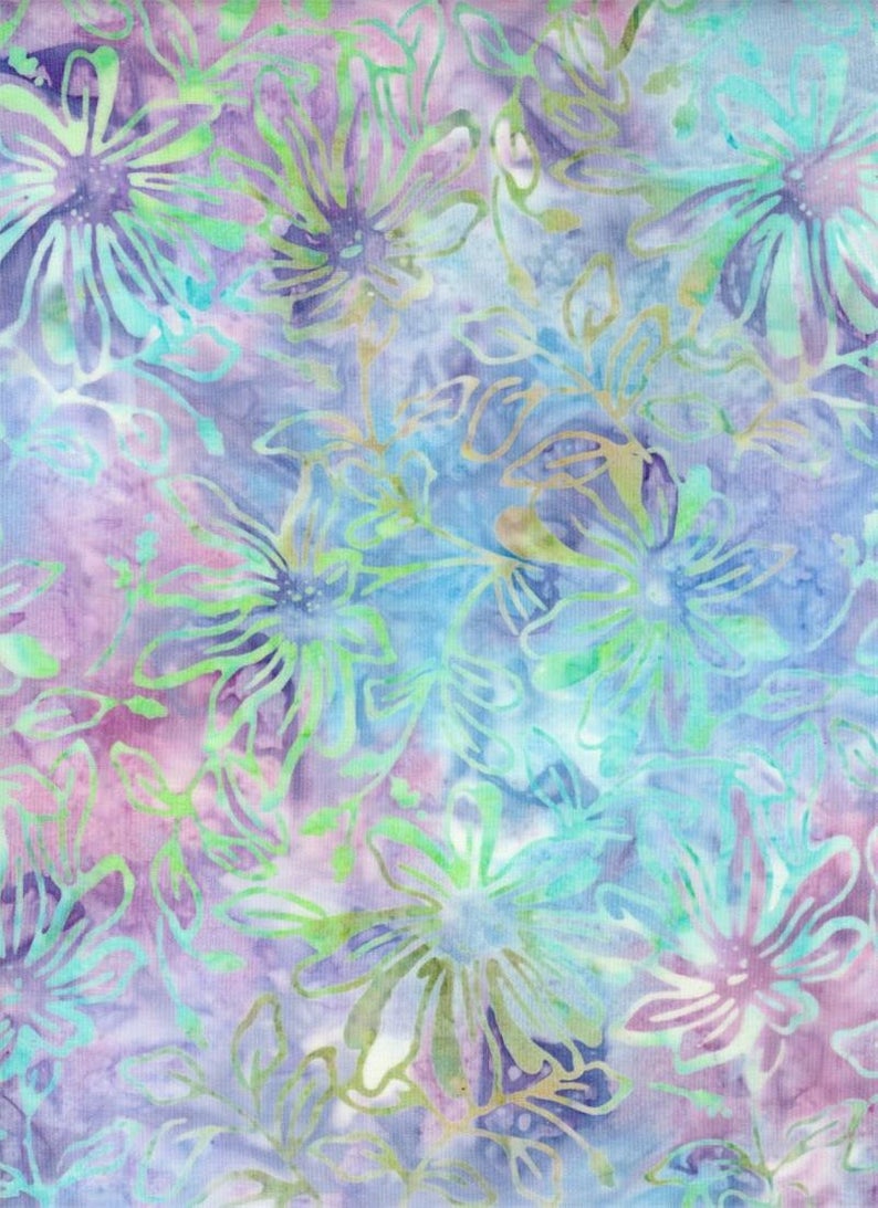 Batik Textiles - 4021 - Blue Purple Pink Flowers - Down Under Fabric
1 × $12.20
Batik Textiles - 4021 - Blue Purple Pink Flowers - Down Under Fabric
1 × $12.20 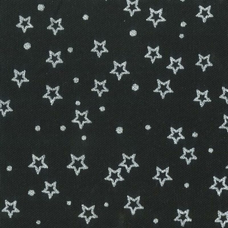 Anthology - BC27 Silver Star - BeColourful - Printed Fabric by JdJ
1 × $12.80
Anthology - BC27 Silver Star - BeColourful - Printed Fabric by JdJ
1 × $12.80 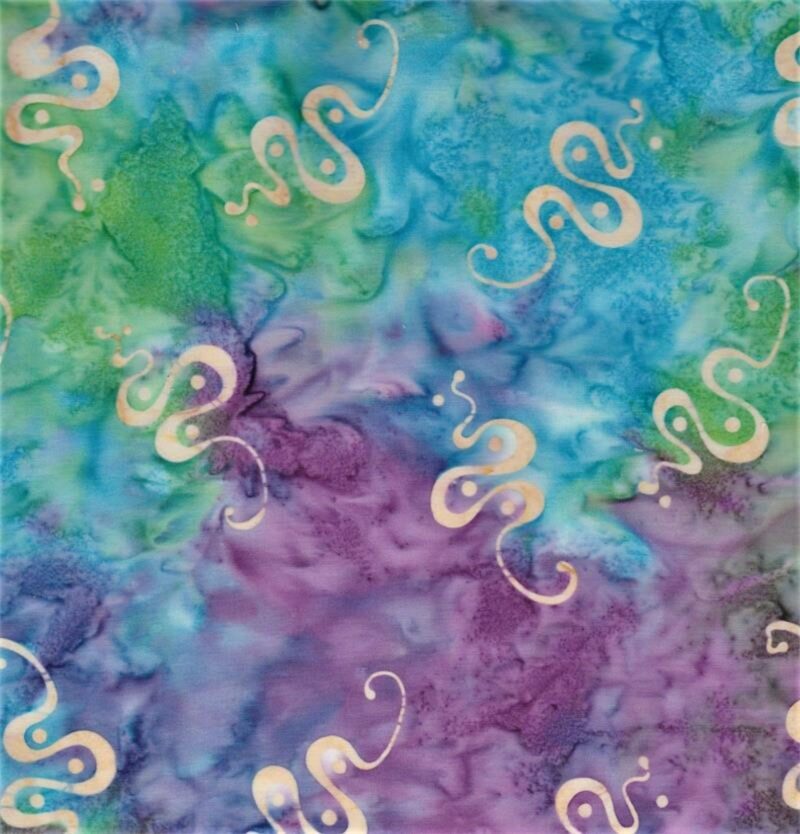 Batik Textiles - 5226 - Purple Blue Green Kokopelli Snake - Desert Blooms Fabric
1 × $11.60
Batik Textiles - 5226 - Purple Blue Green Kokopelli Snake - Desert Blooms Fabric
1 × $11.60 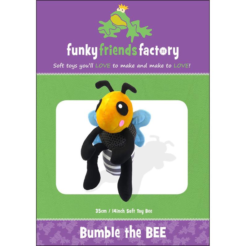 Bumble the Bee - Stuffed Animal Toy Sewing Pattern - Funky Friends Factory - Cute Adorable Squeeze
1 × $12.00
Bumble the Bee - Stuffed Animal Toy Sewing Pattern - Funky Friends Factory - Cute Adorable Squeeze
1 × $12.00 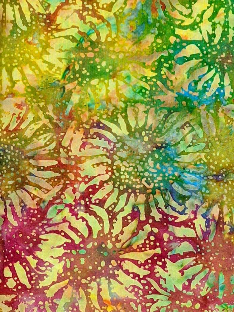 Anthology - BC34 Multi Sunflowers - BeColourful - Batik Fabric by JdJ - 31" Remnant
1 × $11.00
Anthology - BC34 Multi Sunflowers - BeColourful - Batik Fabric by JdJ - 31" Remnant
1 × $11.00 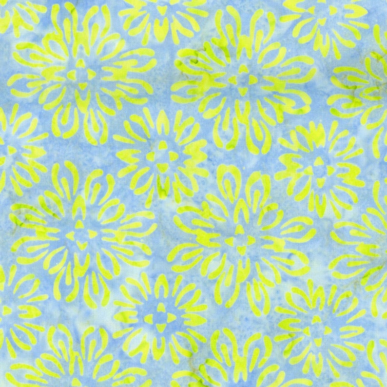 Maywood Studio - MASB37-BS - Gray Blue Yellow Mum - Bejeweled Batiks Fabric
1 × $11.80
Maywood Studio - MASB37-BS - Gray Blue Yellow Mum - Bejeweled Batiks Fabric
1 × $11.80 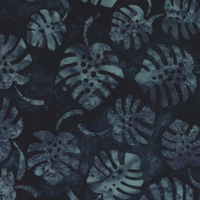 Maywood Studio - MASB43-22 - Dark Indigo Leaves - Coastal Getaway Batik Fabric
1 × $11.60
Maywood Studio - MASB43-22 - Dark Indigo Leaves - Coastal Getaway Batik Fabric
1 × $11.60 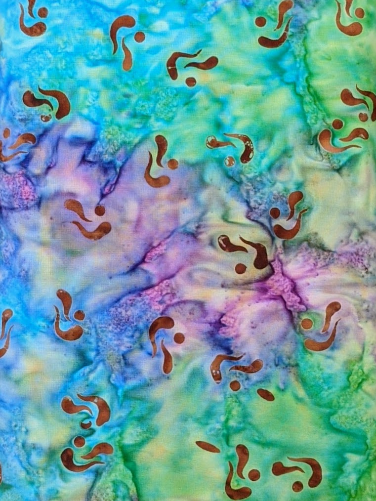 Batik Textiles - 5220 - Multi Aboriginal Blender - Desert Blooms Kokopelli Fabric
1 × $11.60
Batik Textiles - 5220 - Multi Aboriginal Blender - Desert Blooms Kokopelli Fabric
1 × $11.60  Jewels of the Universe - BOM Quilt Pattern Booklet - In The Beginning Fabrics - Jason Yenter
1 × $15.50
Jewels of the Universe - BOM Quilt Pattern Booklet - In The Beginning Fabrics - Jason Yenter
1 × $15.50 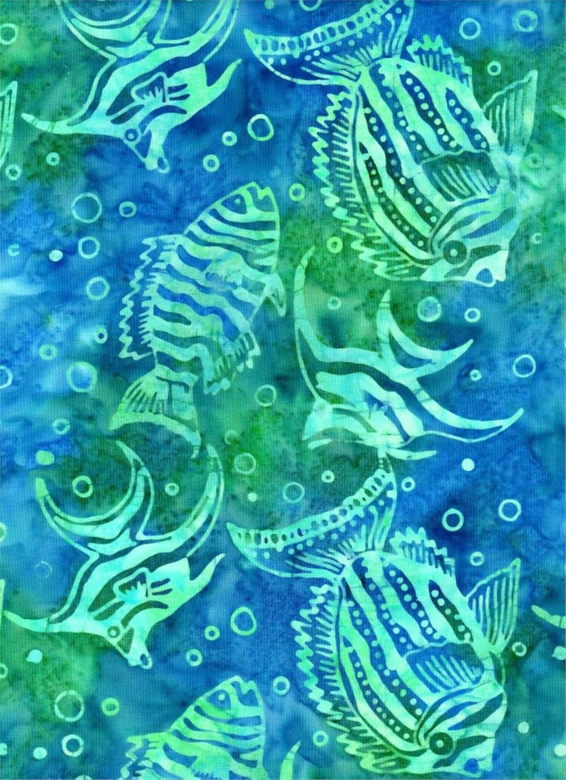 Batik Textiles - 4020 - Blue Green Fish - Down Under Fabric
3 × $12.20
Batik Textiles - 4020 - Blue Green Fish - Down Under Fabric
3 × $12.20 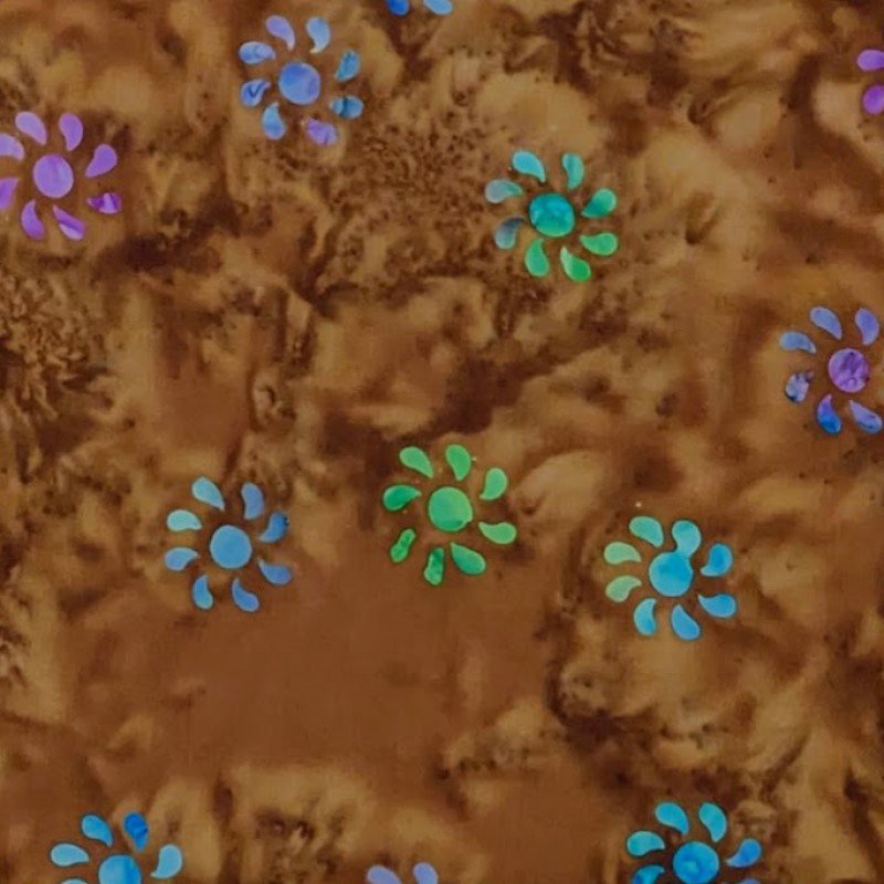 Batik Textiles - 5217 - Brown Kokopelli Flower - Desert Blooms Fabric
1 × $11.80
Batik Textiles - 5217 - Brown Kokopelli Flower - Desert Blooms Fabric
1 × $11.80 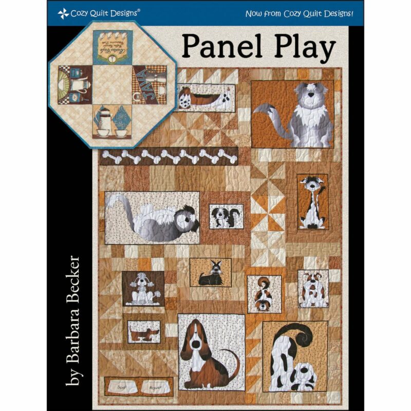 Panel Play Quilt Pattern Booklet - Cozy Quilt Designs - Barbara Becker - Using Panels in Quilts
1 × $16.00
Panel Play Quilt Pattern Booklet - Cozy Quilt Designs - Barbara Becker - Using Panels in Quilts
1 × $16.00  Batik Textiles - 4019 - Blue Green Bubbles - Down Under Fabric
1 × $12.20
Batik Textiles - 4019 - Blue Green Bubbles - Down Under Fabric
1 × $12.20 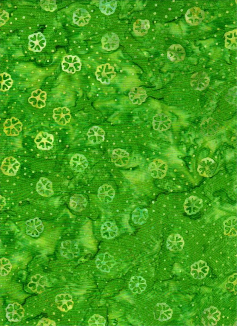 Batik Textiles - 4216 - Bright Green Flowers - Remnants of Summer Fabric
1 × $12.20
Batik Textiles - 4216 - Bright Green Flowers - Remnants of Summer Fabric
1 × $12.20 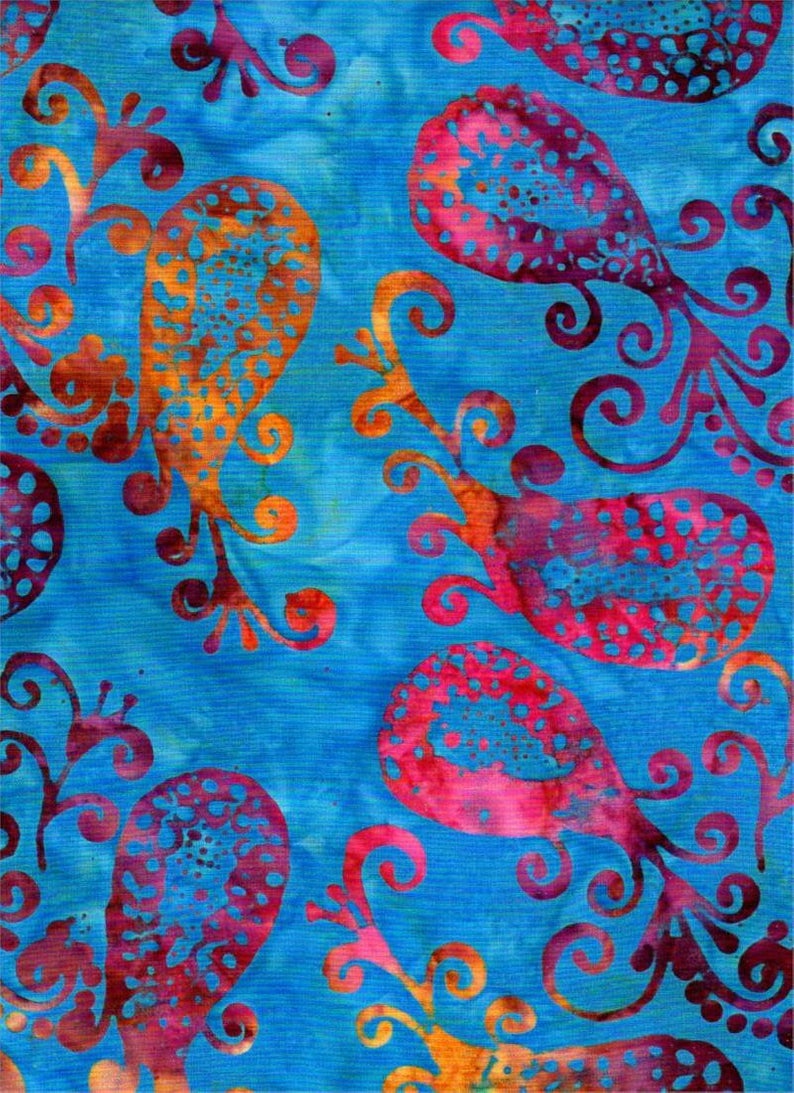 Batik Textiles - 4536 - Fiery Blue Paisley - Serendipity Fabric
1 × $11.40
Batik Textiles - 4536 - Fiery Blue Paisley - Serendipity Fabric
1 × $11.40 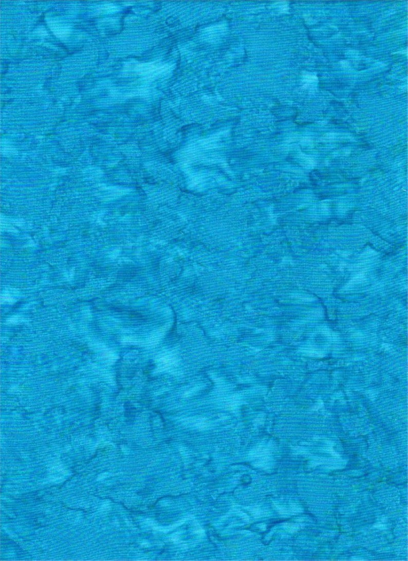 Batik Textiles - 4537B - Blue Watercolor - Serendipity - Fabric Blender
2 × $11.80
Batik Textiles - 4537B - Blue Watercolor - Serendipity - Fabric Blender
2 × $11.80  Hoffman Alaska - F2030-73 Ocean - Salmon Run - Custom Bali Batiks
1 × $12.60
Hoffman Alaska - F2030-73 Ocean - Salmon Run - Custom Bali Batiks
1 × $12.60 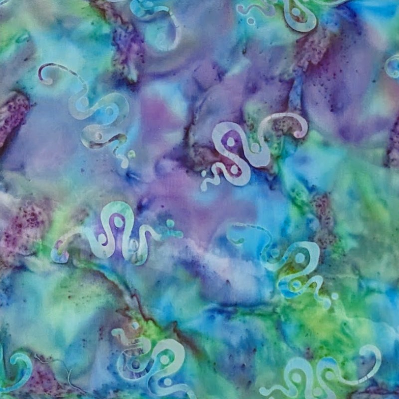 Batik Textiles - 5230 - Blue Green Teal Kokopelli Snake - Desert Blooms Fabric
1 × $11.80
Batik Textiles - 5230 - Blue Green Teal Kokopelli Snake - Desert Blooms Fabric
1 × $11.80 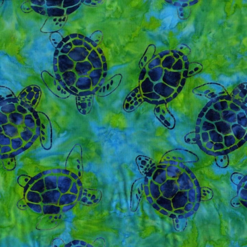 Michael Miller - Sea Turtles Green Blue - BT6392-SEAX-D - Marine Batik Fabric - 26" Remnant
1 × $8.70
Michael Miller - Sea Turtles Green Blue - BT6392-SEAX-D - Marine Batik Fabric - 26" Remnant
1 × $8.70 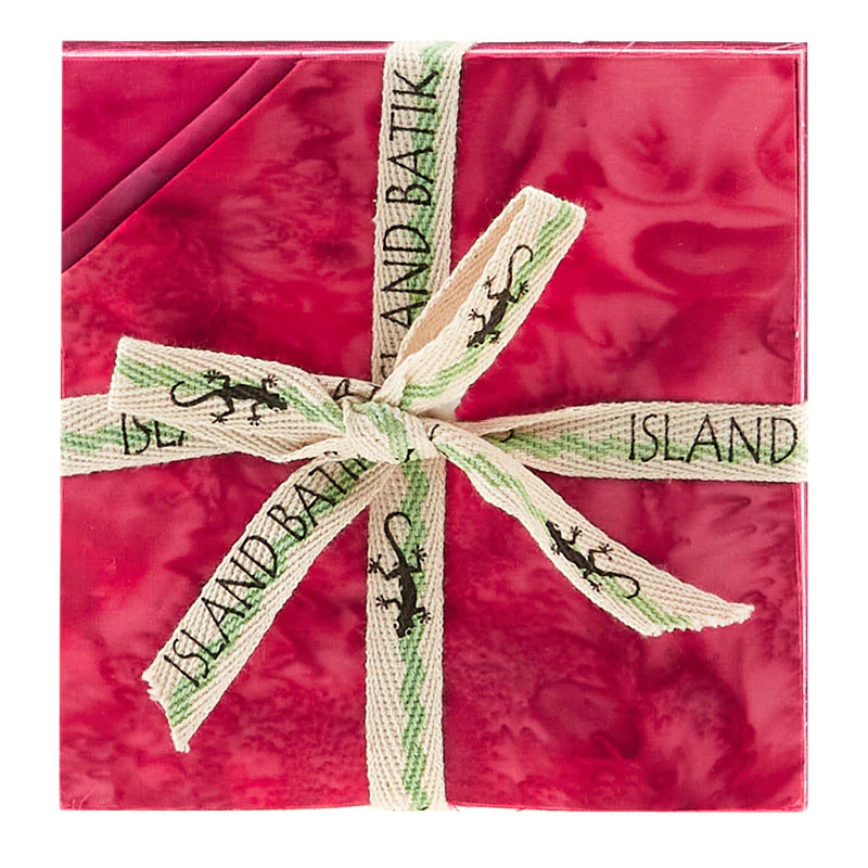 Island Batik - IB 5" Fabric Stamp - Precious Pink - Foundations Basics
1 × $14.00
Island Batik - IB 5" Fabric Stamp - Precious Pink - Foundations Basics
1 × $14.00 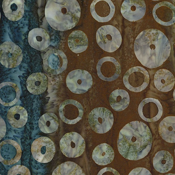 Michael Miller - Espresso Orbit - BT9194-ESPR-D - Batik Fabric
1 × $13.00
Michael Miller - Espresso Orbit - BT9194-ESPR-D - Batik Fabric
1 × $13.00 Subtotal: $392.20
.
Cart will be automatically cleared after 48 hours of no activity.