

You may be interested in…

.
Cart will be automatically cleared after 48 hours of no activity.
 Batik Textiles - 4224 - Blue Green Leaf - Remnants of Summer - Fabric
1 × $11.60
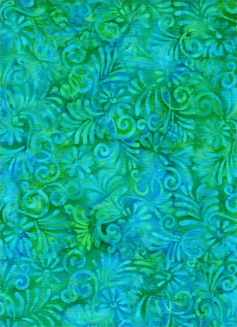
Batik Textiles - 4224 - Blue Green Leaf - Remnants of Summer - Fabric
1 × $11.60 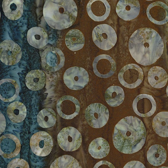 Michael Miller - Espresso Orbit - BT9194-ESPR-D - Batik Fabric
1 × $13.00
Michael Miller - Espresso Orbit - BT9194-ESPR-D - Batik Fabric
1 × $13.00 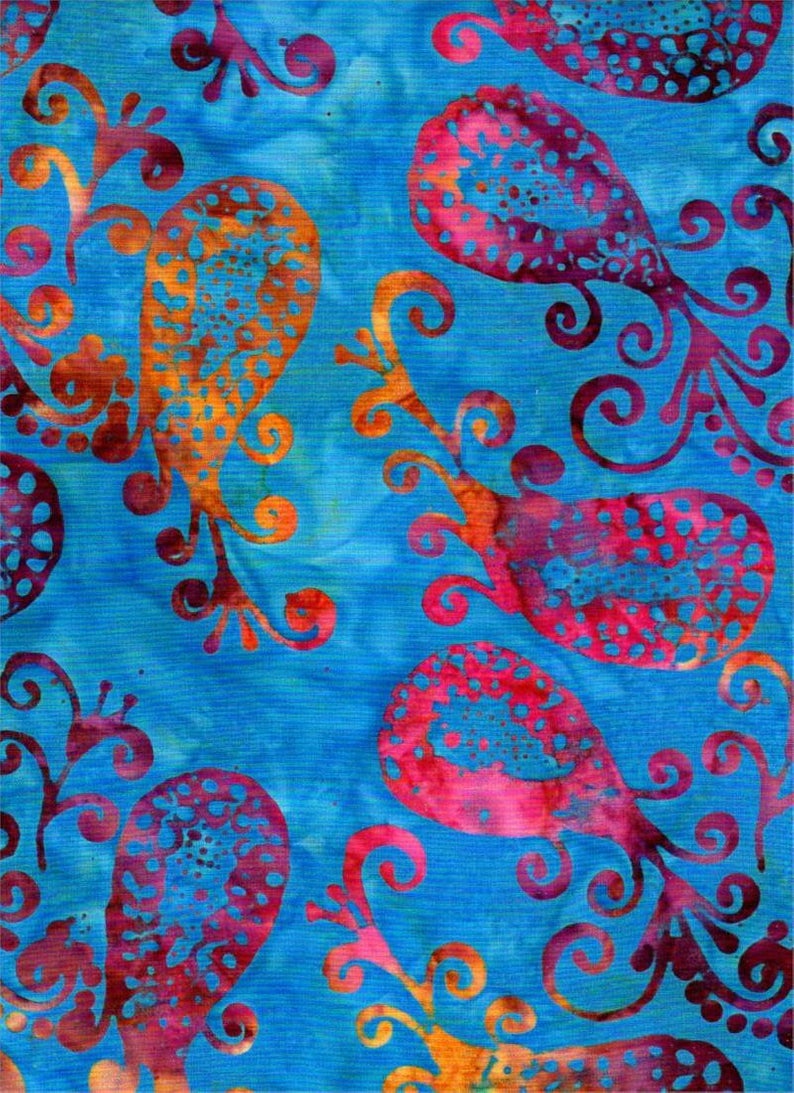 Batik Textiles - 4536 - Fiery Blue Paisley - Serendipity Fabric
2 × $11.40
Batik Textiles - 4536 - Fiery Blue Paisley - Serendipity Fabric
2 × $11.40 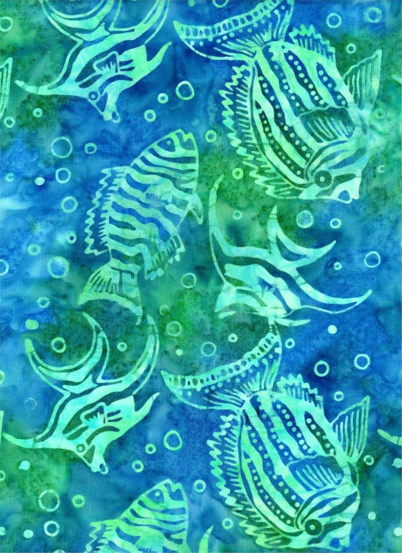 Batik Textiles - 4020 - Blue Green Fish - Down Under Fabric
1 × $12.20
Batik Textiles - 4020 - Blue Green Fish - Down Under Fabric
1 × $12.20 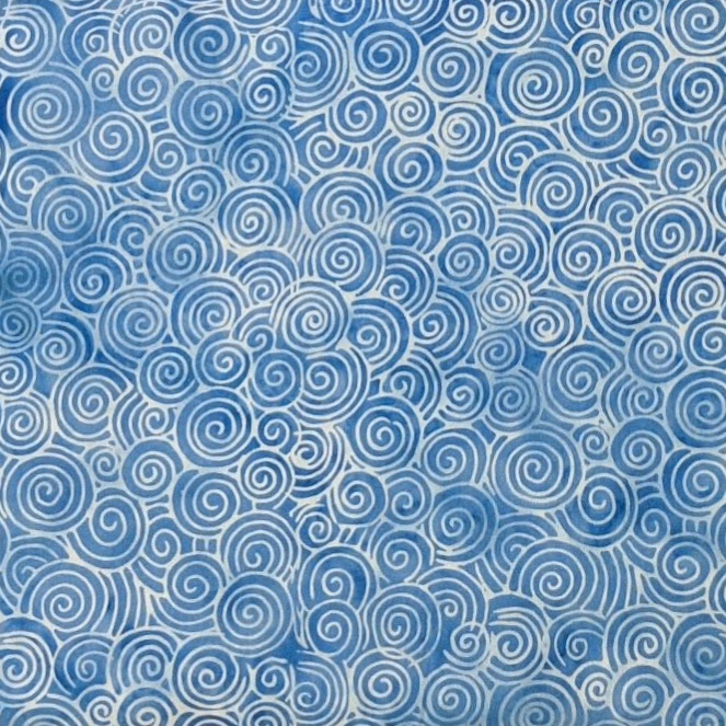 Island Batik - IB 112259515 - Blue Chambray Small Swirl - Heartland
1 × $12.40
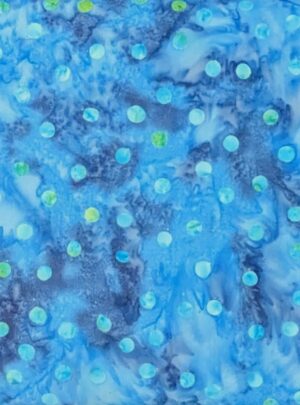
Island Batik - IB 112259515 - Blue Chambray Small Swirl - Heartland
1 × $12.40 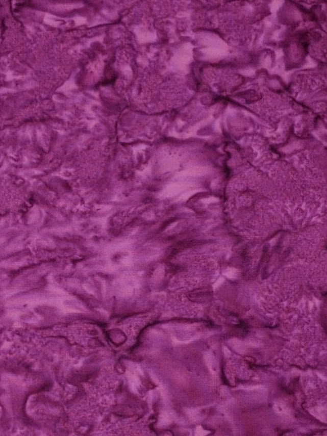 Batik Textiles - 4541 - Magenta Watercolor - Serendipity Blender Fabric
1 × $11.80
Batik Textiles - 4541 - Magenta Watercolor - Serendipity Blender Fabric
1 × $11.80 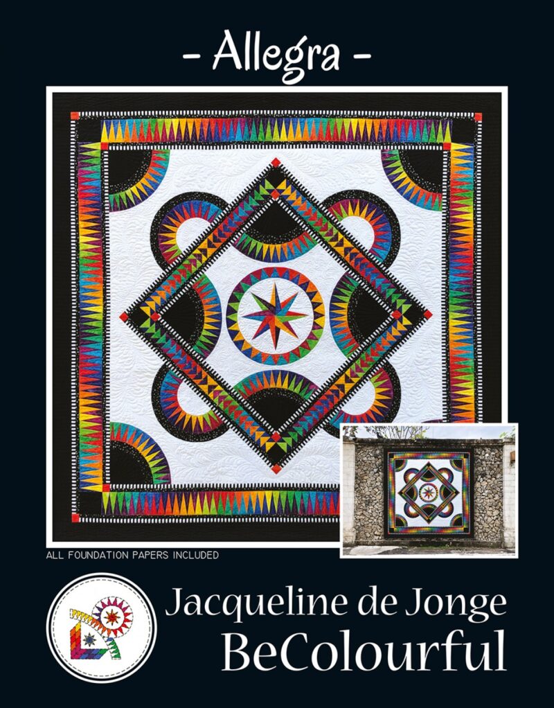 Allegra - Foundation Paper Piecing Pattern - BC1904 - Be Colourful - Jacqueline de Jonge
1 × $51.50
Allegra - Foundation Paper Piecing Pattern - BC1904 - Be Colourful - Jacqueline de Jonge
1 × $51.50  Batik Textiles - 4021 - Blue Purple Pink Flowers - Down Under Fabric
1 × $12.20
Batik Textiles - 4021 - Blue Purple Pink Flowers - Down Under Fabric
1 × $12.20 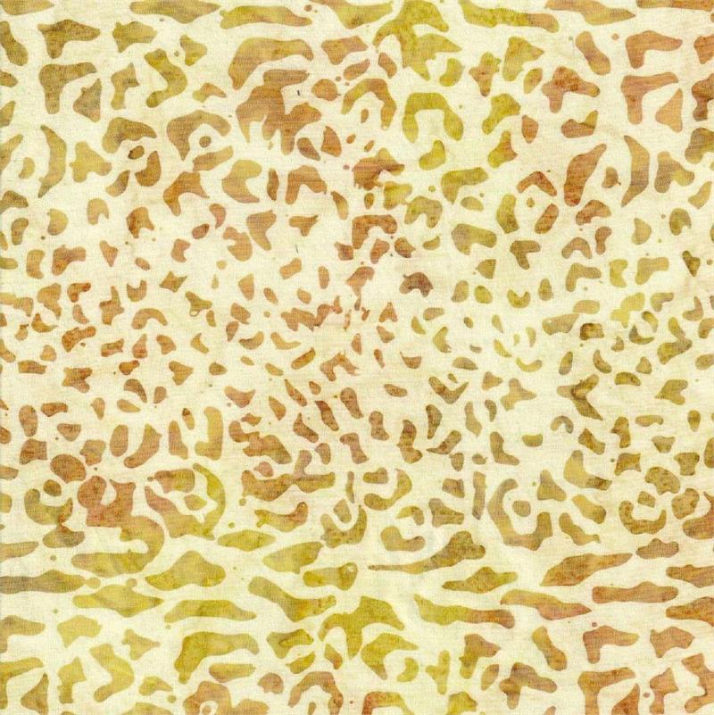 Batik Textiles - 5502 - Beige Leopard - Summer Safari
1 × $12.20
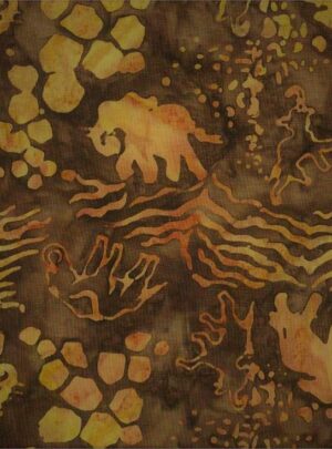
Batik Textiles - 5502 - Beige Leopard - Summer Safari
1 × $12.20 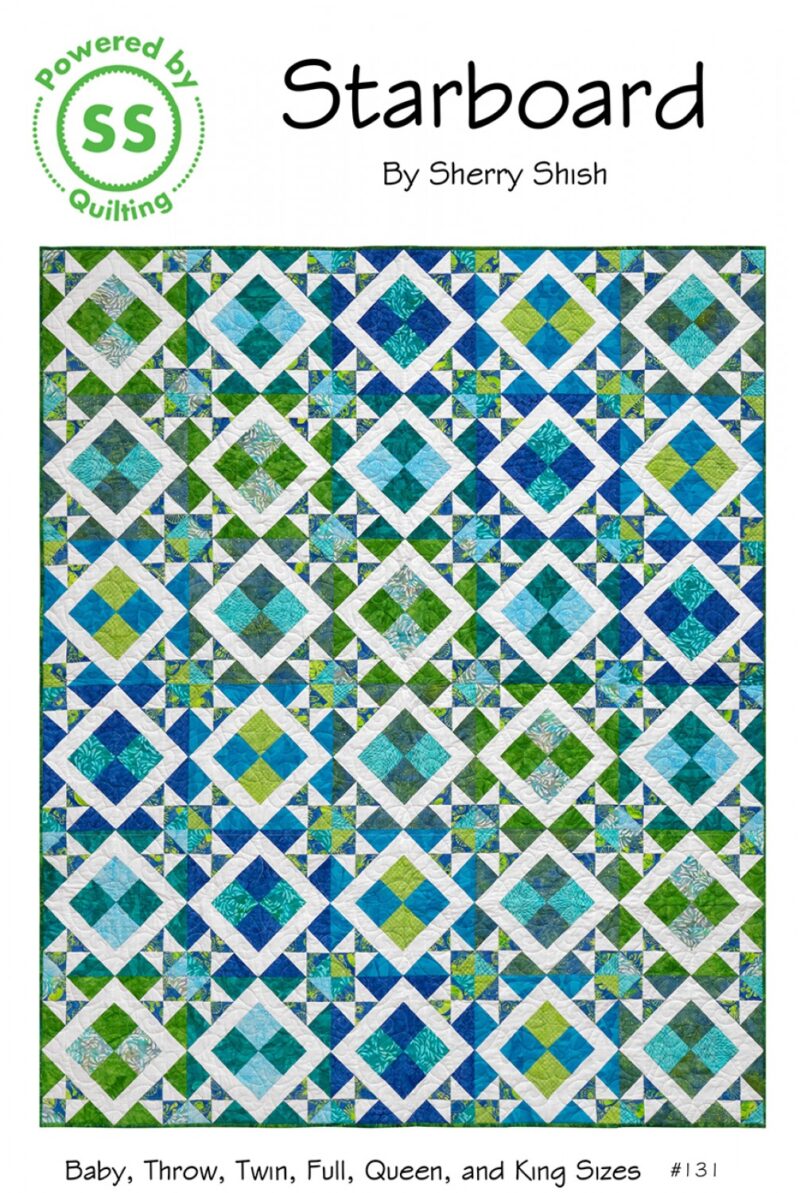 Starboard Quilt Pattern - Sherry Shish - Powered By Quilting 131
1 × $10.00
Starboard Quilt Pattern - Sherry Shish - Powered By Quilting 131
1 × $10.00  Anthology - 2311Q-X - Tide Circular Rose - Oceania Baliscapes - Batik Fabric
1 × $12.80
Anthology - 2311Q-X - Tide Circular Rose - Oceania Baliscapes - Batik Fabric
1 × $12.80  Batik Textiles - 4537B - Blue Watercolor - Serendipity - Fabric Blender
1 × $11.80
Batik Textiles - 4537B - Blue Watercolor - Serendipity - Fabric Blender
1 × $11.80  Batik Textiles - 5228 - Purple Green Cactus Flower - Desert Blooms Kokopelli Fabric
1 × $11.80
Batik Textiles - 5228 - Purple Green Cactus Flower - Desert Blooms Kokopelli Fabric
1 × $11.80 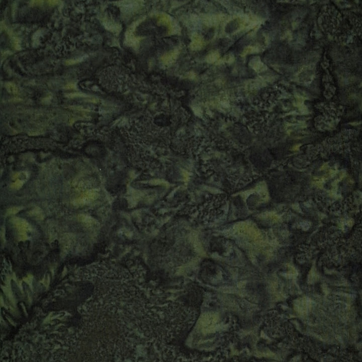 Hoffman California - 1895-157 Verde - Watercolor Batik Fabric
1 × $10.80
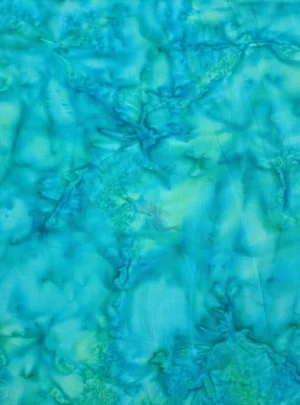
Hoffman California - 1895-157 Verde - Watercolor Batik Fabric
1 × $10.80 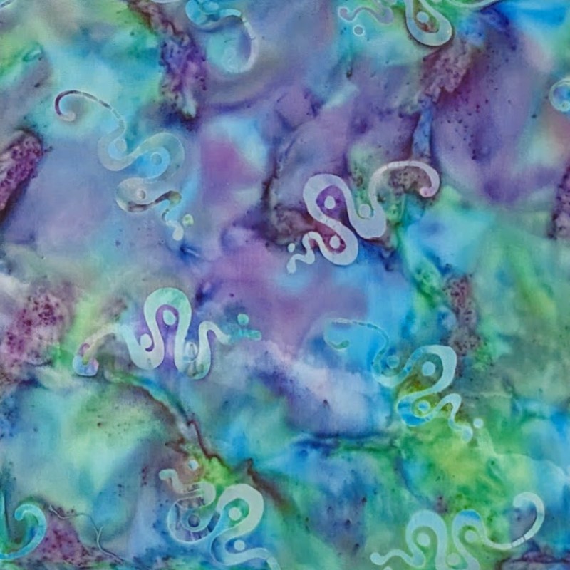 Batik Textiles - 5230 - Blue Green Teal Kokopelli Snake - Desert Blooms Fabric
1 × $11.80
Batik Textiles - 5230 - Blue Green Teal Kokopelli Snake - Desert Blooms Fabric
1 × $11.80 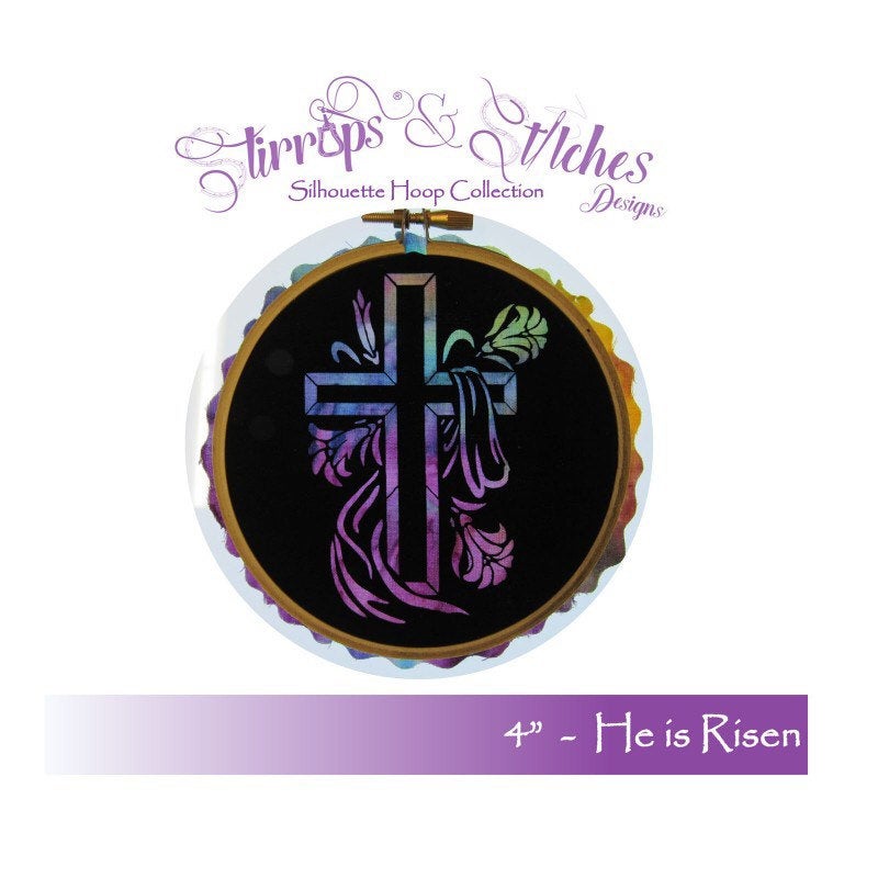 He Is Risen - 4" Hoop Laser Kit - Stirrups & Stitches Designs - No Sew - Easter Cross Lilies
1 × $12.00
He Is Risen - 4" Hoop Laser Kit - Stirrups & Stitches Designs - No Sew - Easter Cross Lilies
1 × $12.00 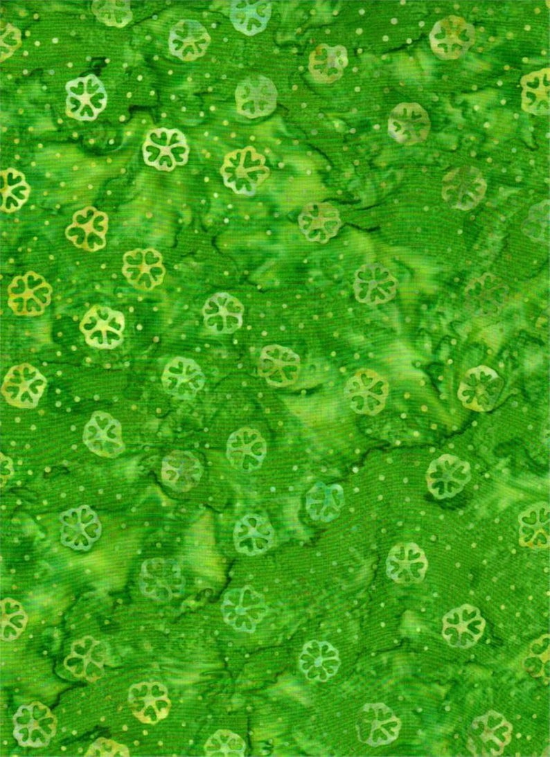 Batik Textiles - 4216 - Bright Green Flowers - Remnants of Summer Fabric
1 × $12.20
Batik Textiles - 4216 - Bright Green Flowers - Remnants of Summer Fabric
1 × $12.20 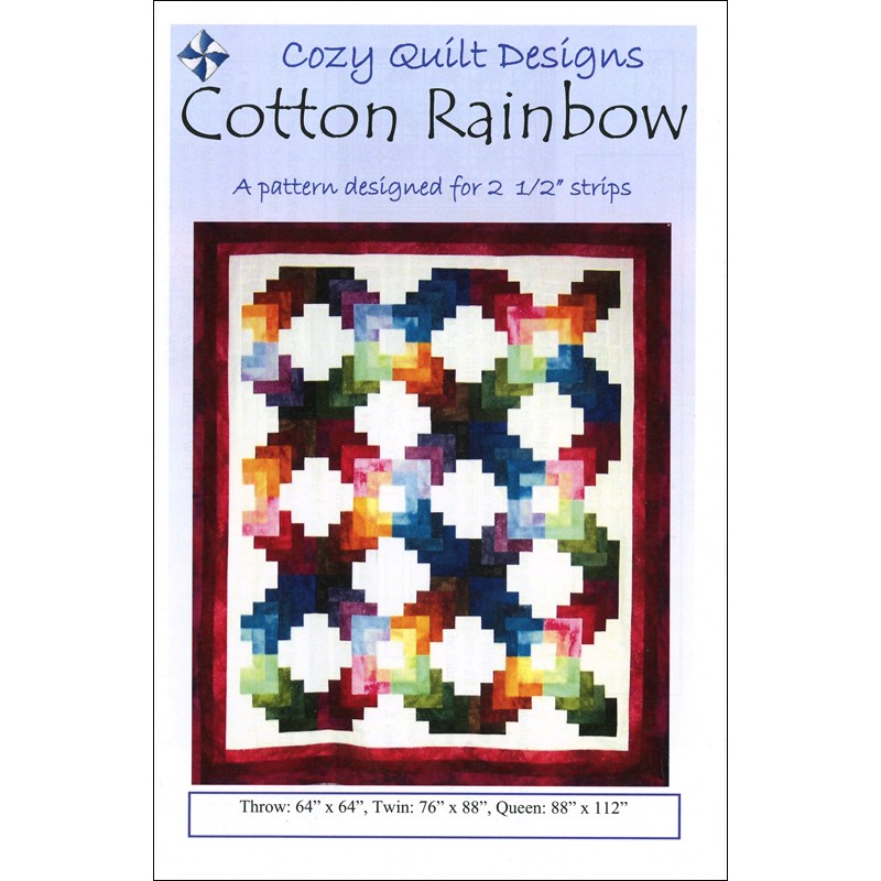 Cotton Rainbow Quilt Pattern - Cozy Quilt Designs - Georgette Dell'Orco - Strip Club
1 × $9.00
Cotton Rainbow Quilt Pattern - Cozy Quilt Designs - Georgette Dell'Orco - Strip Club
1 × $9.00 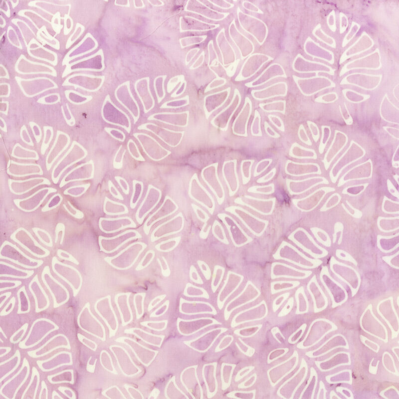 Anthology - 359Q-X - Lilac Leaf Cutouts - Flirt Collection - Batik Fabric by Jacqueline de Jonge
1 × $12.80
Anthology - 359Q-X - Lilac Leaf Cutouts - Flirt Collection - Batik Fabric by Jacqueline de Jonge
1 × $12.80 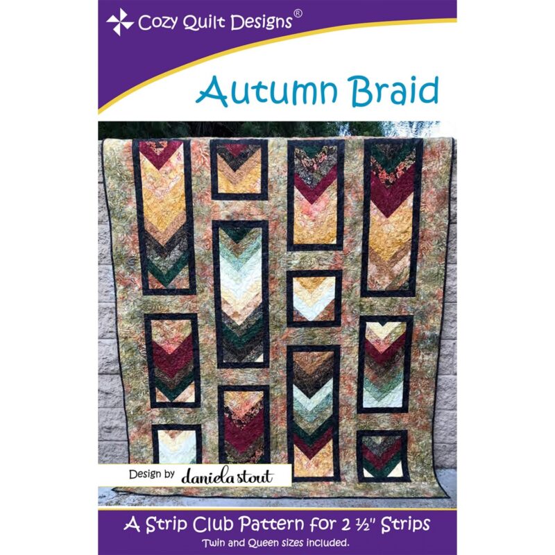 Autumn Braid Quilt Pattern - Cozy Quilt Designs - Daniela Stout - Strip Club
1 × $9.00
Autumn Braid Quilt Pattern - Cozy Quilt Designs - Daniela Stout - Strip Club
1 × $9.00  Batik Textiles - 5226 - Purple Blue Green Kokopelli Snake - Desert Blooms Fabric
1 × $11.60
Batik Textiles - 5226 - Purple Blue Green Kokopelli Snake - Desert Blooms Fabric
1 × $11.60 Subtotal: $295.30
.
Cart will be automatically cleared after 48 hours of no activity.