

You may be interested in…
.
Cart will be automatically cleared after 48 hours of no activity.
 Island Batik - IB 122016048 - Blonde Ale Triangle Tree - Holly Holiday
1 × $12.20
Island Batik - IB 122016048 - Blonde Ale Triangle Tree - Holly Holiday
1 × $12.20 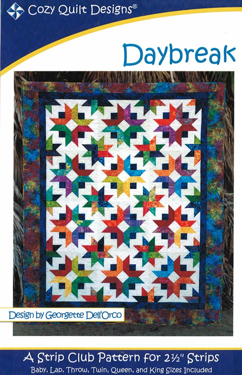 Daybreak Quilt Pattern- Cozy Quilt Designs - Georgette Dell'Orco - Strip Club
1 × $8.50
Daybreak Quilt Pattern- Cozy Quilt Designs - Georgette Dell'Orco - Strip Club
1 × $8.50 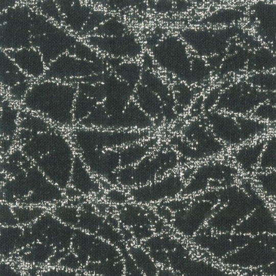 Anthology - BC35 Black - Diamond Dust Glitter - BeColourful - Printed Fabric by JdJ
1 × $12.80
Anthology - BC35 Black - Diamond Dust Glitter - BeColourful - Printed Fabric by JdJ
1 × $12.80 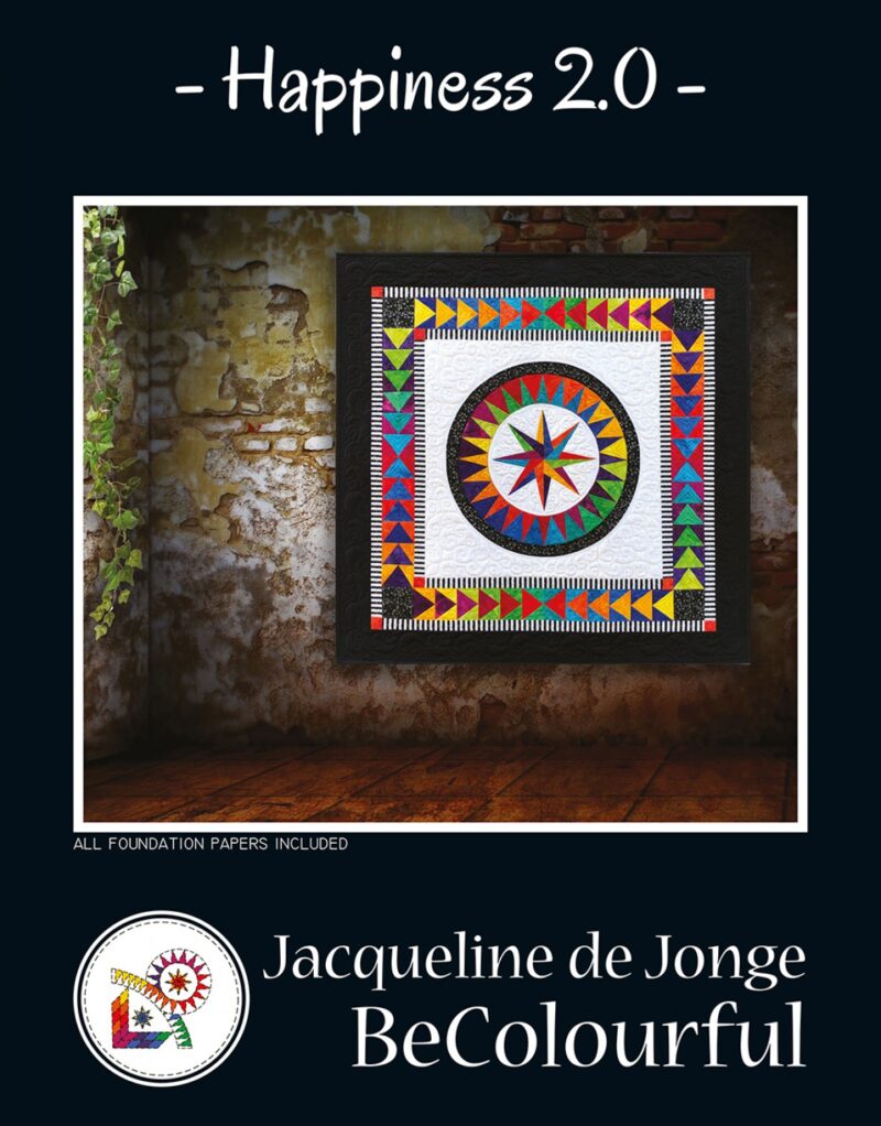 Happiness 2.0 - Foundation Paper Piecing Pattern - BC1902 - Be Colourful - Jacqueline de Jonge
1 × $35.00
Happiness 2.0 - Foundation Paper Piecing Pattern - BC1902 - Be Colourful - Jacqueline de Jonge
1 × $35.00 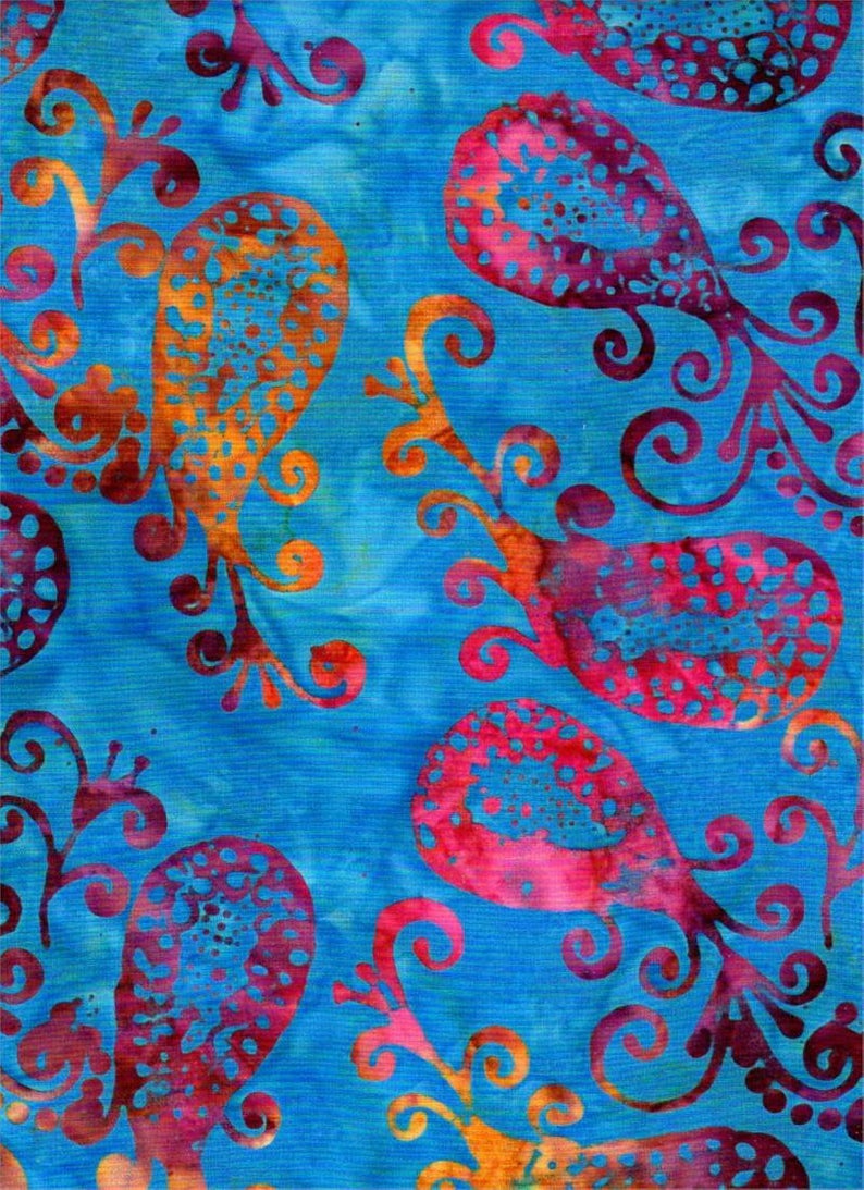 Batik Textiles - 4536 - Fiery Blue Paisley - Serendipity Fabric
1 × $11.40
Batik Textiles - 4536 - Fiery Blue Paisley - Serendipity Fabric
1 × $11.40 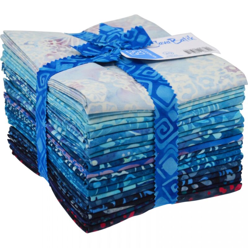 Blue - 20 Fat Quarters - 18" x 20" - Maywood Studio Java Batik Fabric
1 × $65.00
Blue - 20 Fat Quarters - 18" x 20" - Maywood Studio Java Batik Fabric
1 × $65.00 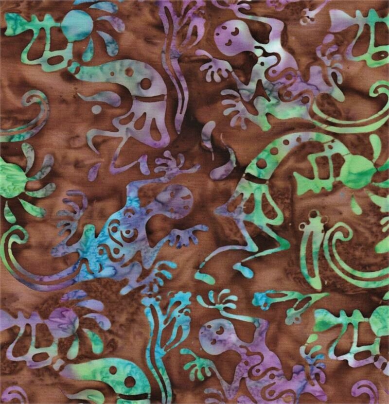 Batik Textiles - 5216 - Brown Kokopelli Lizard - Desert Blooms Fabric
1 × $11.80
Batik Textiles - 5216 - Brown Kokopelli Lizard - Desert Blooms Fabric
1 × $11.80 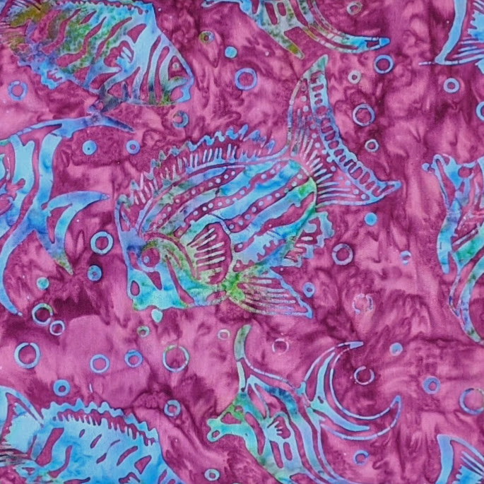 Batik Textiles - 4538 - Magenta Fish Bubbles - Serendipity Fabric
1 × $11.80
Batik Textiles - 4538 - Magenta Fish Bubbles - Serendipity Fabric
1 × $11.80 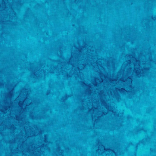 Hoffman California - 1895-61 Turquoise - Bali Batik Watercolor Fabric
1 × $10.80
Hoffman California - 1895-61 Turquoise - Bali Batik Watercolor Fabric
1 × $10.80  Batik Textiles - 6002 - Purple Kokopelli Watercolor Blender - Desert Blooms Fabric
1 × $11.60
Batik Textiles - 6002 - Purple Kokopelli Watercolor Blender - Desert Blooms Fabric
1 × $11.60 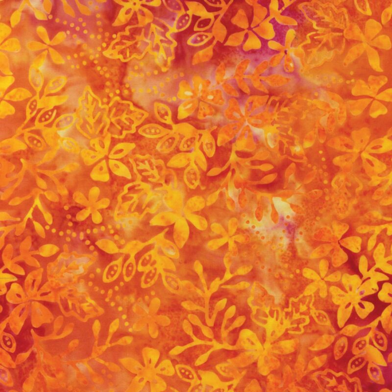 Benartex - 9220-28 - Fruit Punch Floral Sprigs - Bali Palettes Summer Batik Fabric
1 × $12.20
Benartex - 9220-28 - Fruit Punch Floral Sprigs - Bali Palettes Summer Batik Fabric
1 × $12.20 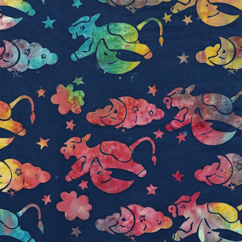 Island Batik - IB 112227575 - Blue Marine Cow Moon Clouds - Play Date
1 × $12.40
Island Batik - IB 112227575 - Blue Marine Cow Moon Clouds - Play Date
1 × $12.40  Hoffman Alaska - S2342-174 Seamist - Geese - Custom Bali Batiks
1 × $12.80
Hoffman Alaska - S2342-174 Seamist - Geese - Custom Bali Batiks
1 × $12.80 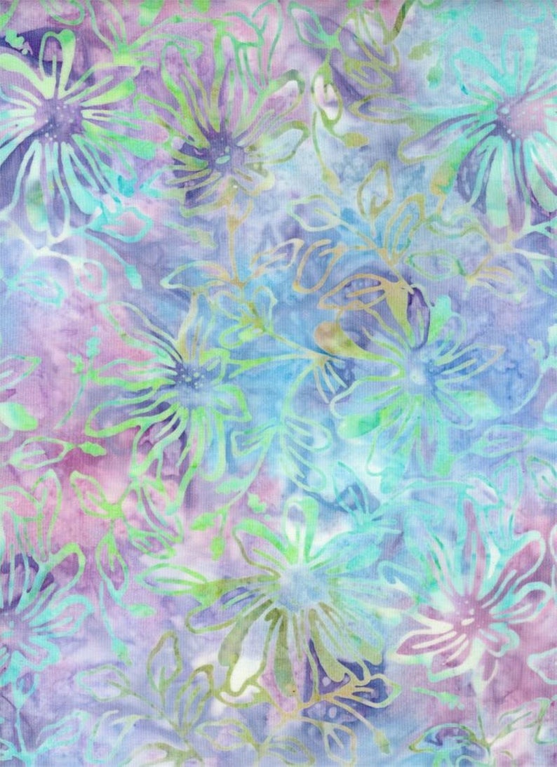 Batik Textiles - 4021 - Blue Purple Pink Flowers - Down Under Fabric
1 × $12.20
Batik Textiles - 4021 - Blue Purple Pink Flowers - Down Under Fabric
1 × $12.20 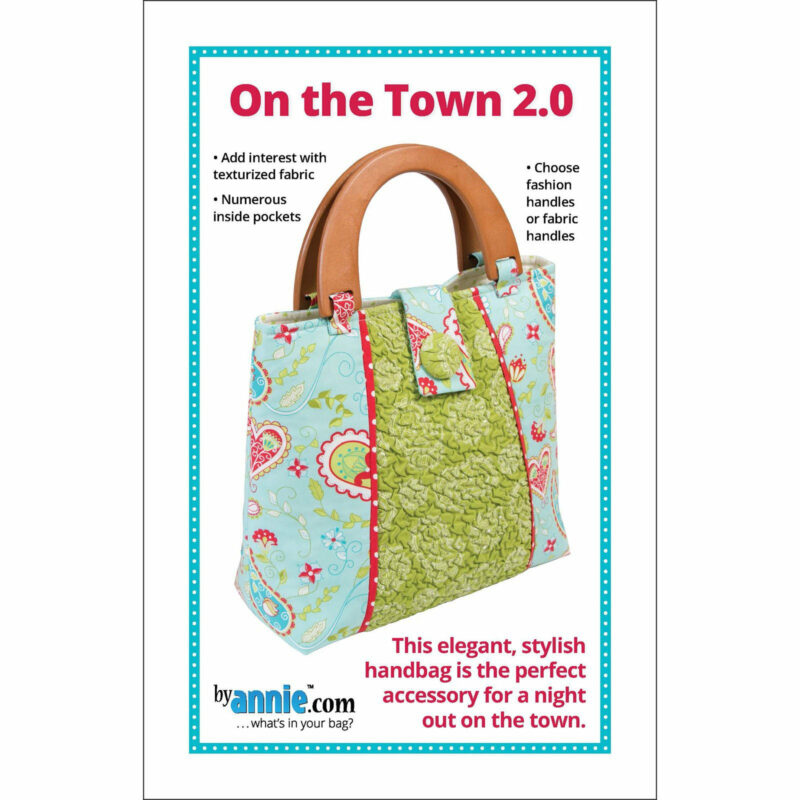 On The Town 2.0 - Sewing Pattern - Byannie.com - Elegant, Stylish, Simple Handbag Purse
1 × $9.00
On The Town 2.0 - Sewing Pattern - Byannie.com - Elegant, Stylish, Simple Handbag Purse
1 × $9.00 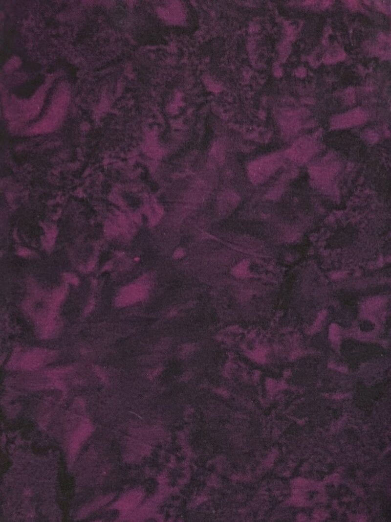 Hoffman California - 1895-711 Deep Fuchsia - Watercolor Blender Batik Fabric
1 × $10.80
Hoffman California - 1895-711 Deep Fuchsia - Watercolor Blender Batik Fabric
1 × $10.80 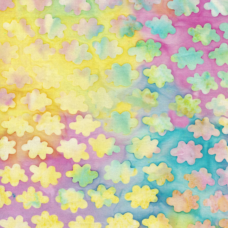 Island Batik - IB 112228800 - Multi Pink Yellow Blue Moonstone Clouds - Baby Bloomers
1 × $12.40
Island Batik - IB 112228800 - Multi Pink Yellow Blue Moonstone Clouds - Baby Bloomers
1 × $12.40 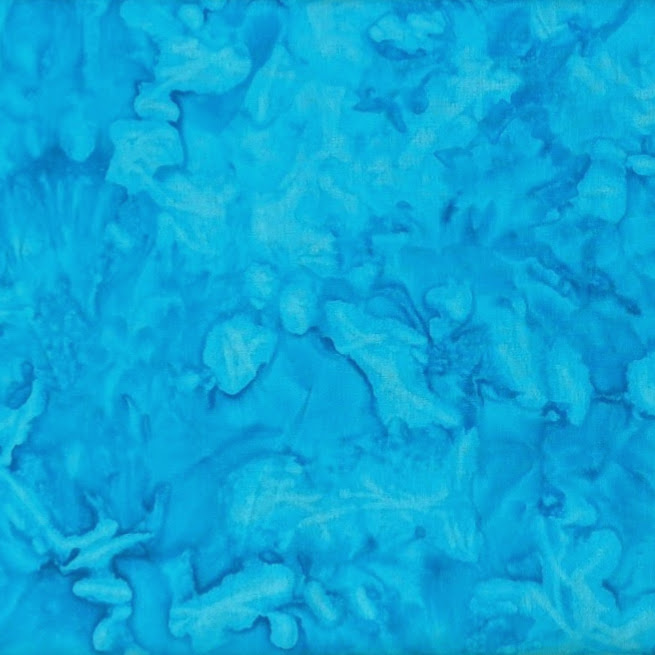 Batik Textiles - 5159 - Blue Kokopelli Watercolor Blender - Desert Blooms Fabric
1 × $10.80
Batik Textiles - 5159 - Blue Kokopelli Watercolor Blender - Desert Blooms Fabric
1 × $10.80 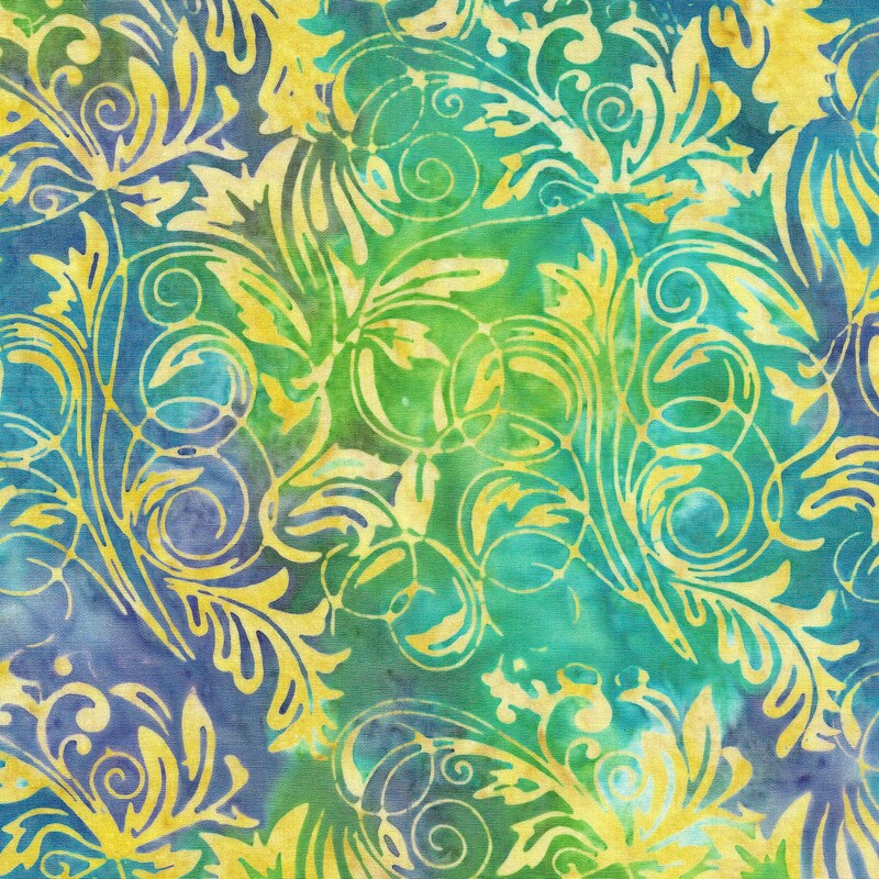 Island Batik - IB 112019883 - Mardigras Leaf Tendrils - Lemon Grass - 13" Remnant
1 × $4.35
Island Batik - IB 112019883 - Mardigras Leaf Tendrils - Lemon Grass - 13" Remnant
1 × $4.35  Jewels of the Universe - BOM Quilt Pattern Booklet - In The Beginning Fabrics - Jason Yenter
1 × $15.50
Jewels of the Universe - BOM Quilt Pattern Booklet - In The Beginning Fabrics - Jason Yenter
1 × $15.50 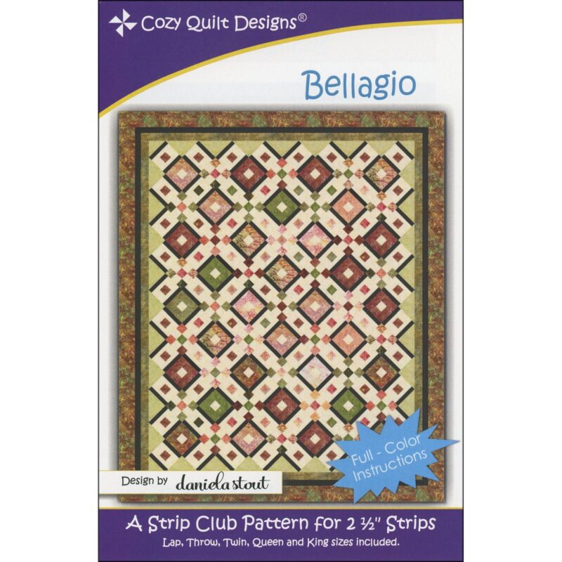 Bellagio Quilt Pattern - Cozy Quilt Designs - Daniela Stout - Strip Club
1 × $9.50
Bellagio Quilt Pattern - Cozy Quilt Designs - Daniela Stout - Strip Club
1 × $9.50 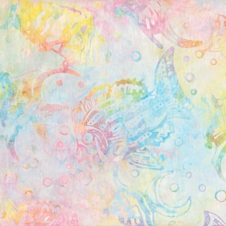 Batik Textiles - 4225 - Pastel Fish - Remnants of Summer Fabric
1 × $11.80
Batik Textiles - 4225 - Pastel Fish - Remnants of Summer Fabric
1 × $11.80 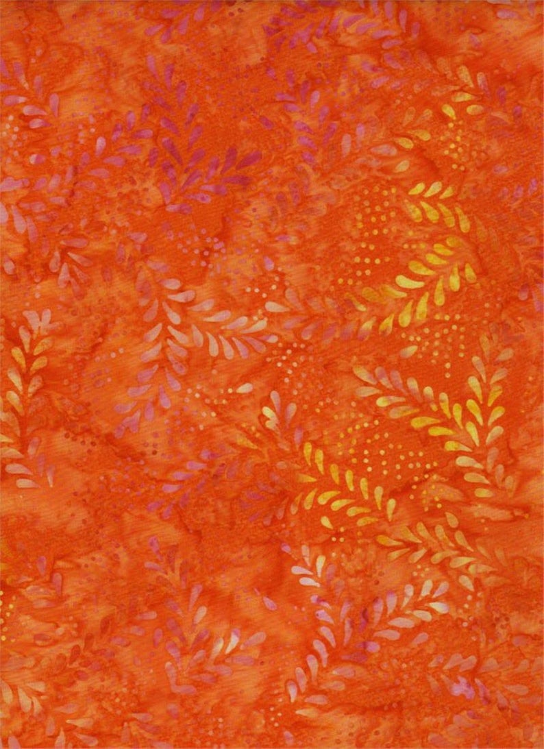 Batik Textiles - 4211 - Bright Orange Leaf - Remnants of Summer Fabric
1 × $11.40
Batik Textiles - 4211 - Bright Orange Leaf - Remnants of Summer Fabric
1 × $11.40 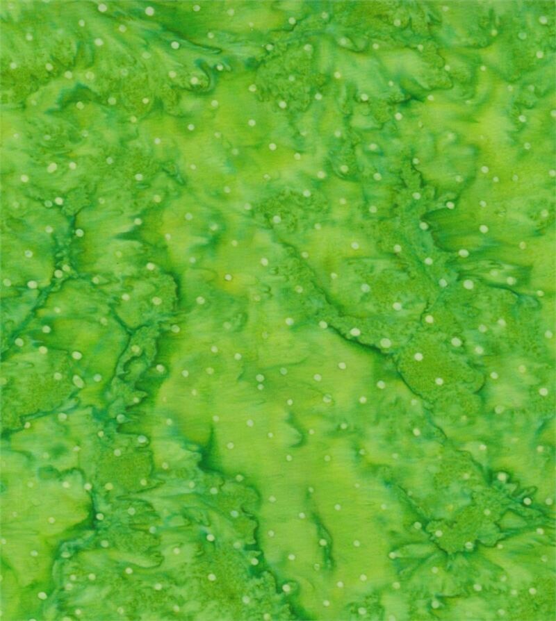 Batik Textiles - 4919 - Spring Green Mini Dots - Earth, Wind & Fire - Fabric Blender
1 × $11.80
Batik Textiles - 4919 - Spring Green Mini Dots - Earth, Wind & Fire - Fabric Blender
1 × $11.80 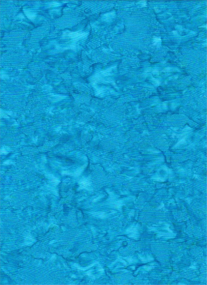 Batik Textiles - 4537B - Blue Watercolor - Serendipity - Fabric Blender
1 × $11.80
Batik Textiles - 4537B - Blue Watercolor - Serendipity - Fabric Blender
1 × $11.80 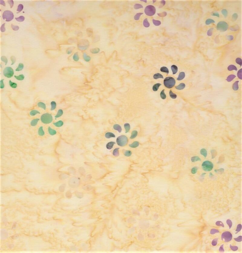 Batik Textiles - 5224 - Cream Kokopelli Flower - Desert Blooms Fabric
1 × $11.80
Batik Textiles - 5224 - Cream Kokopelli Flower - Desert Blooms Fabric
1 × $11.80 Subtotal: $371.45
.
Cart will be automatically cleared after 48 hours of no activity.