

You may be interested in…

.
Cart will be automatically cleared after 48 hours of no activity.
 That PURPLE THANG Tool - Little Foot Ltd Quilt Shoppe - Plastic Turner
1 × $3.80
That PURPLE THANG Tool - Little Foot Ltd Quilt Shoppe - Plastic Turner
1 × $3.80 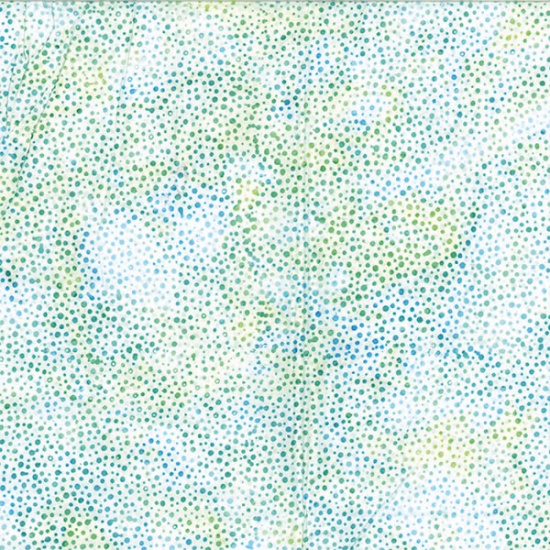 Hoffman California - 885-226 Seaholly - Bali Dots Batik Fabric
2 × $12.60
Hoffman California - 885-226 Seaholly - Bali Dots Batik Fabric
2 × $12.60 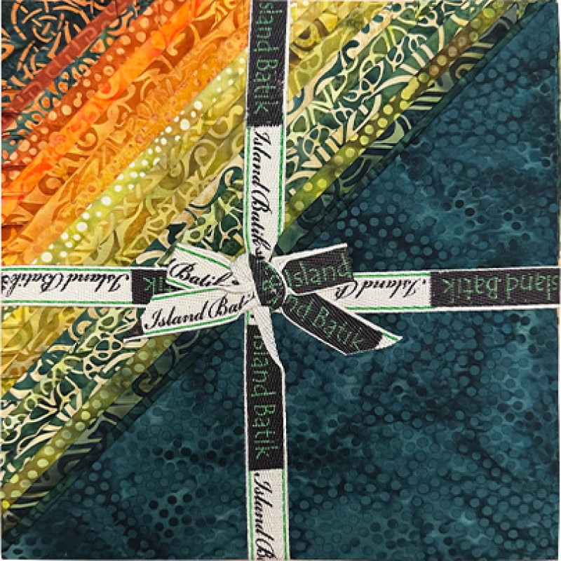 Island Batik - IB 10" Fabric Stack ST - Celtic Fields
2 × $46.00
Island Batik - IB 10" Fabric Stack ST - Celtic Fields
2 × $46.00 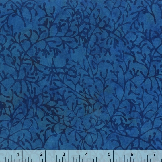 Anthology - 3164Q-X - Blue Branches - Peacock by JdJ - Batik Fabric
2 × $12.80
Anthology - 3164Q-X - Blue Branches - Peacock by JdJ - Batik Fabric
2 × $12.80 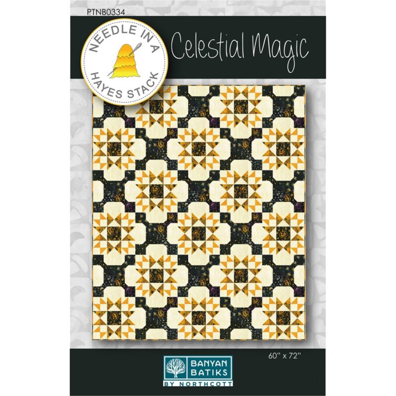 Celestial Magic Quilt Pattern - Needle In A Hayes Stack - Tiffany Hayes
1 × $12.00
Celestial Magic Quilt Pattern - Needle In A Hayes Stack - Tiffany Hayes
1 × $12.00 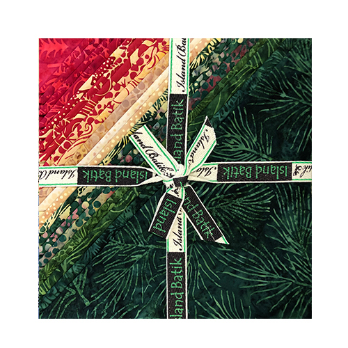 Island Batik - IB 10" Fabric Stack ST - Winter Wonders
2 × $46.00
Island Batik - IB 10" Fabric Stack ST - Winter Wonders
2 × $46.00  Majestic Batiks - 006 Dots - Dark Pumpkin Orange - Fabric Blender
2 × $13.20
Majestic Batiks - 006 Dots - Dark Pumpkin Orange - Fabric Blender
2 × $13.20 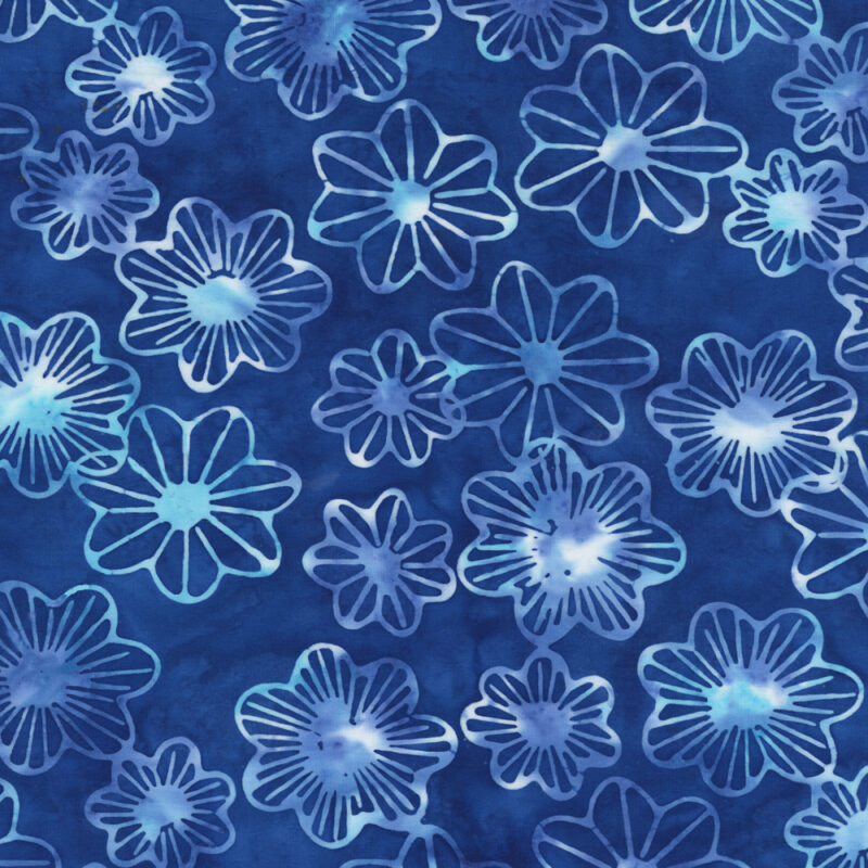 Anthology - 3419Q-X Blue Lilypad - Midnight Moon by JdJ - Batik Fabric
2 × $12.80
Anthology - 3419Q-X Blue Lilypad - Midnight Moon by JdJ - Batik Fabric
2 × $12.80 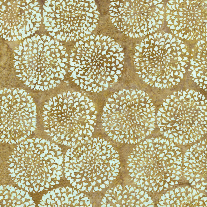 Island Batik - IB 712203065 - Brown Jute Marigold Flower - Naturescape
2 × $12.60
Island Batik - IB 712203065 - Brown Jute Marigold Flower - Naturescape
2 × $12.60 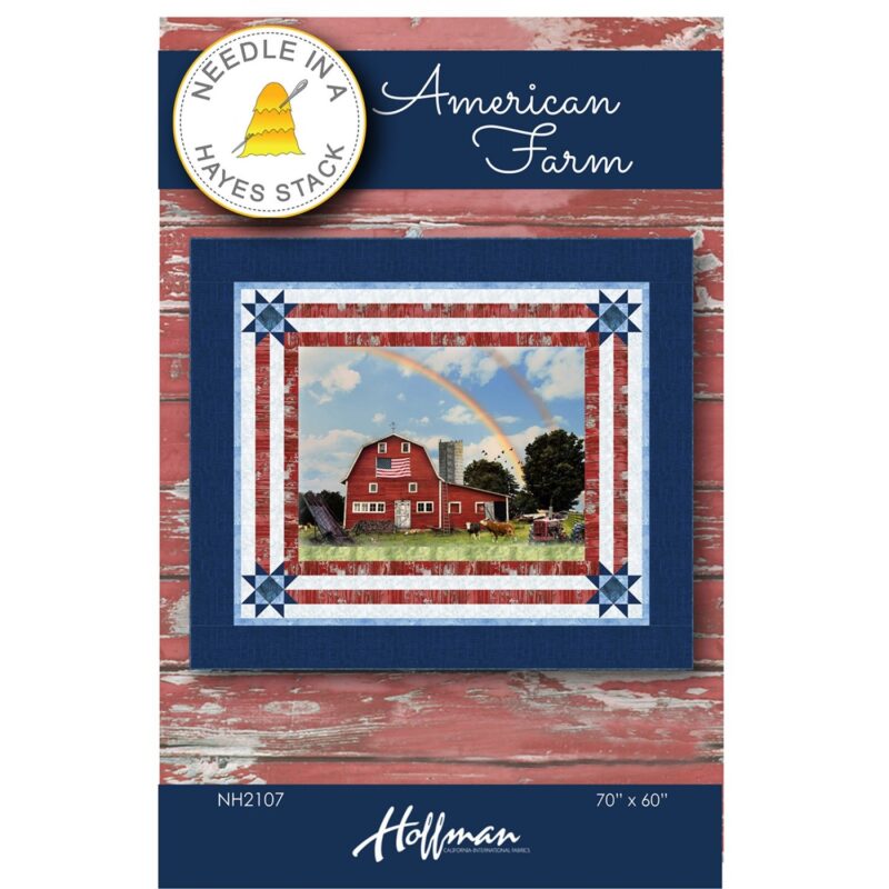 American Farm Quilt Pattern - Needle In A Hayes Stack - Tiffany Hayes
2 × $10.00
American Farm Quilt Pattern - Needle In A Hayes Stack - Tiffany Hayes
2 × $10.00  Island Batik - IB 10" Fabric Stack ST - Sandalwood
2 × $46.00
Island Batik - IB 10" Fabric Stack ST - Sandalwood
2 × $46.00 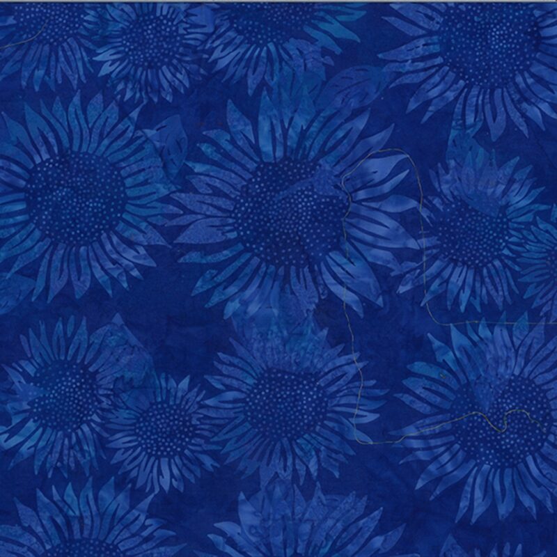 Hoffman California - V2546-360 Waikiki - Sunflower - Bali Batik
2 × $12.60
Hoffman California - V2546-360 Waikiki - Sunflower - Bali Batik
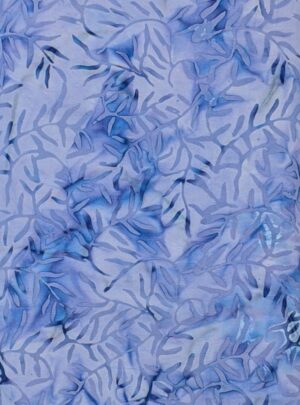
2 × $12.60 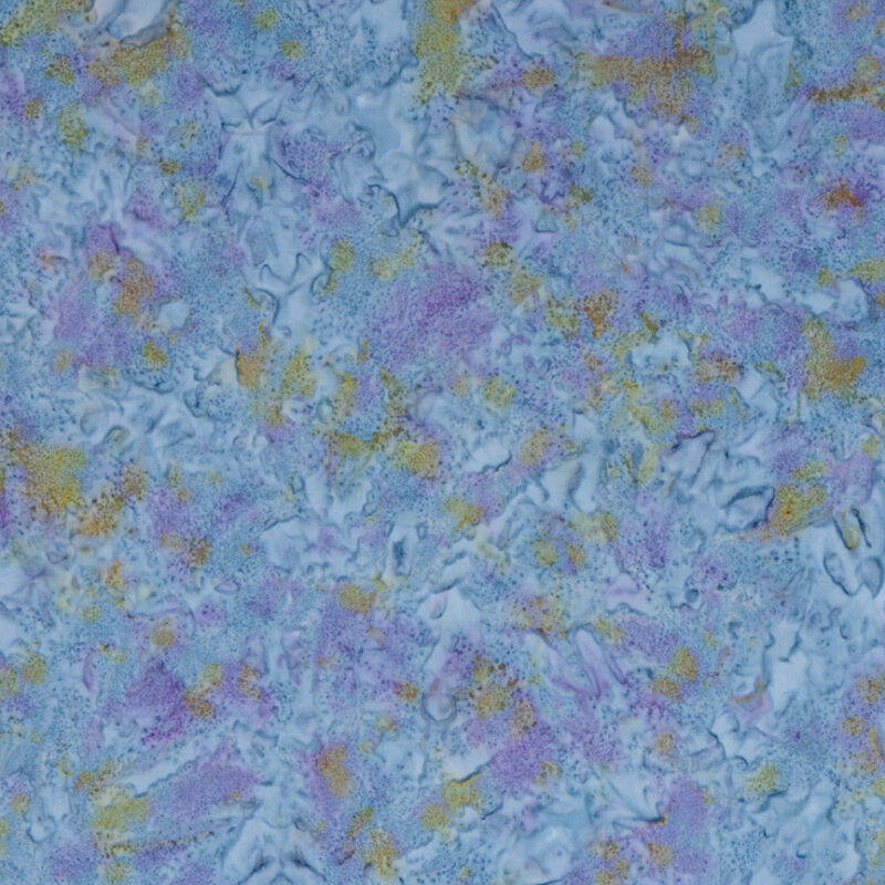 Riley Blake - BTHH238 Blue Violet Multi 1 - Hand Dyes - Batik Fabric
1 × $12.00
Riley Blake - BTHH238 Blue Violet Multi 1 - Hand Dyes - Batik Fabric
1 × $12.00  Hoffman California - 1895-87 Blueberry - Watercolor Batik Fabric
2 × $10.80
Hoffman California - 1895-87 Blueberry - Watercolor Batik Fabric
2 × $10.80  Island Batik - IB 422306680 - Green Spinach Blowing Leaves - Breezy
2 × $12.60
Island Batik - IB 422306680 - Green Spinach Blowing Leaves - Breezy
2 × $12.60 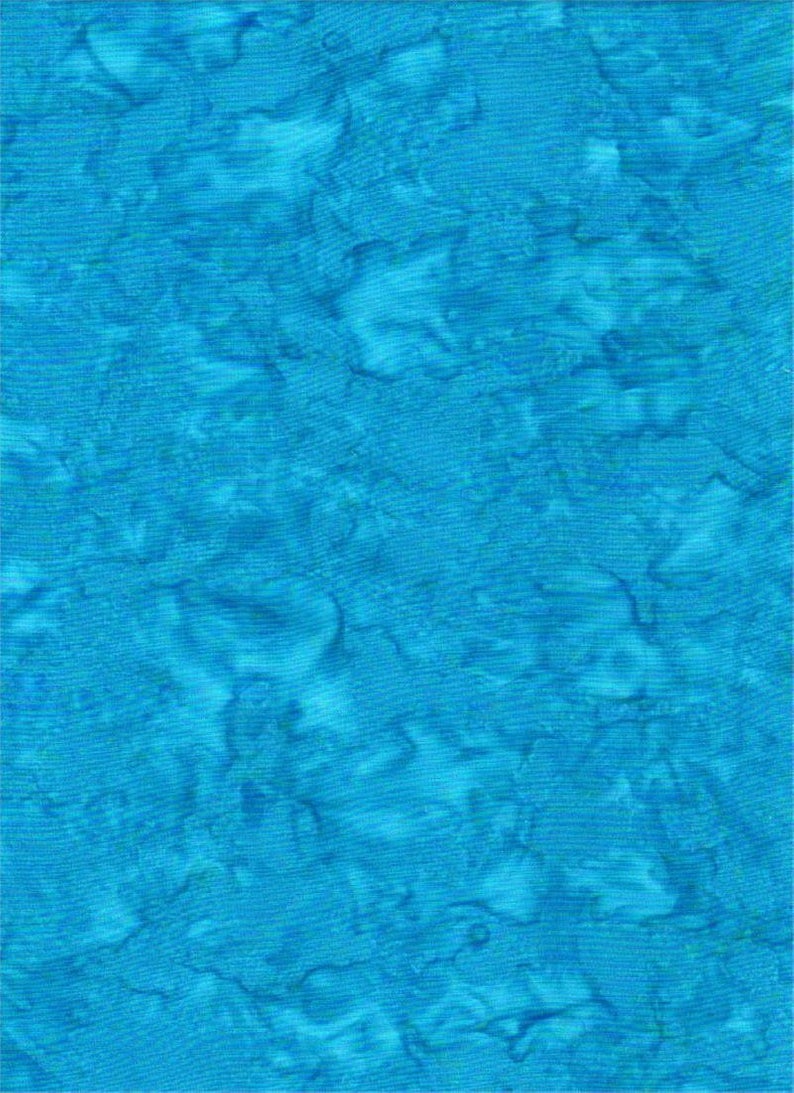 Batik Textiles - 4537B - Blue Watercolor - Serendipity - Fabric Blender
1 × $11.80
Batik Textiles - 4537B - Blue Watercolor - Serendipity - Fabric Blender
1 × $11.80  Riley Blake - BTAP258 Purple Multi 1 - Hand Dyes - Batik Fabric
2 × $12.00
Riley Blake - BTAP258 Purple Multi 1 - Hand Dyes - Batik Fabric
2 × $12.00 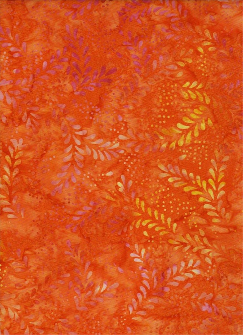 Batik Textiles - 4211 - Bright Orange Leaf - Remnants of Summer Fabric
1 × $11.40
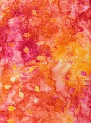
Batik Textiles - 4211 - Bright Orange Leaf - Remnants of Summer Fabric
1 × $11.40  Island Batik - IB 112249051 - Brown Ecru Chicken Wire - Farm Country
2 × $12.40
Island Batik - IB 112249051 - Brown Ecru Chicken Wire - Farm Country
2 × $12.40 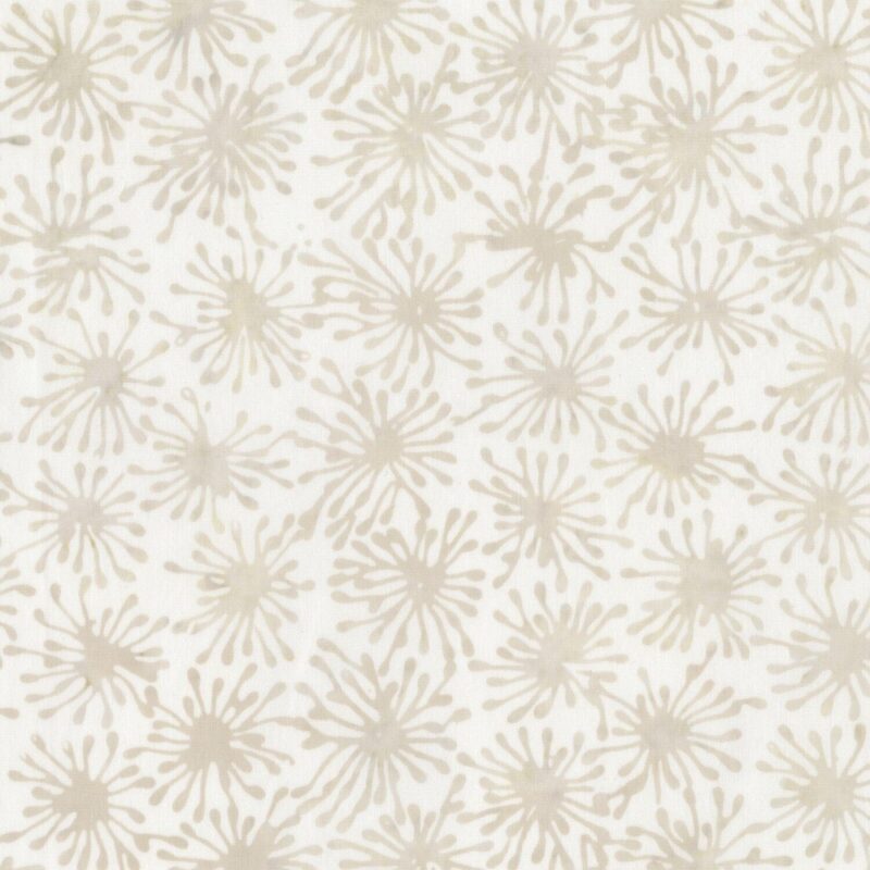 Anthology - 9117Q-X - Whisper Cells - Whisper 6 - Batik Fabric
2 × $12.80
Anthology - 9117Q-X - Whisper Cells - Whisper 6 - Batik Fabric
2 × $12.80 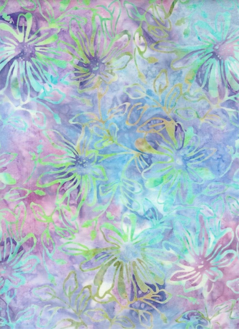 Batik Textiles - 4021 - Blue Purple Pink Flowers - Down Under Fabric
2 × $12.20
Batik Textiles - 4021 - Blue Purple Pink Flowers - Down Under Fabric
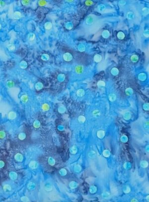
2 × $12.20 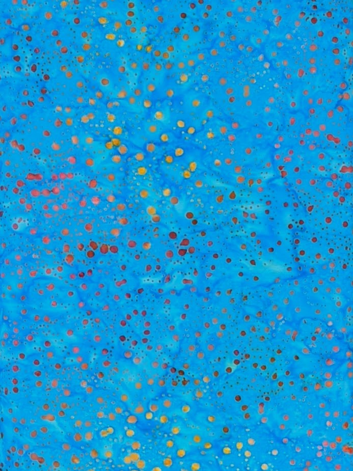 Batik Textiles - 4535 - Fiery Blue Dots - Serendipity Fabric
1 × $11.80
Batik Textiles - 4535 - Fiery Blue Dots - Serendipity Fabric
1 × $11.80 Subtotal: $657.60
.
Cart will be automatically cleared after 48 hours of no activity.