

You may be interested in…


.
Cart will be automatically cleared after 48 hours of no activity.
 Island Batik - IB 112228527 - Blue Waterfall Clouds - Play Date
1 × $12.40
Island Batik - IB 112228527 - Blue Waterfall Clouds - Play Date
1 × $12.40  Batik Textiles - 4225 - Pastel Fish - Remnants of Summer Fabric
1 × $11.80
Batik Textiles - 4225 - Pastel Fish - Remnants of Summer Fabric
1 × $11.80 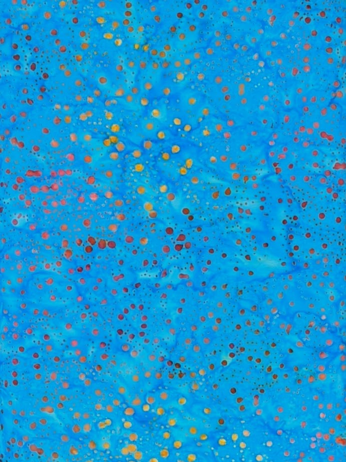 Batik Textiles - 4535 - Fiery Blue Dots - Serendipity Fabric
1 × $11.80
Batik Textiles - 4535 - Fiery Blue Dots - Serendipity Fabric
1 × $11.80 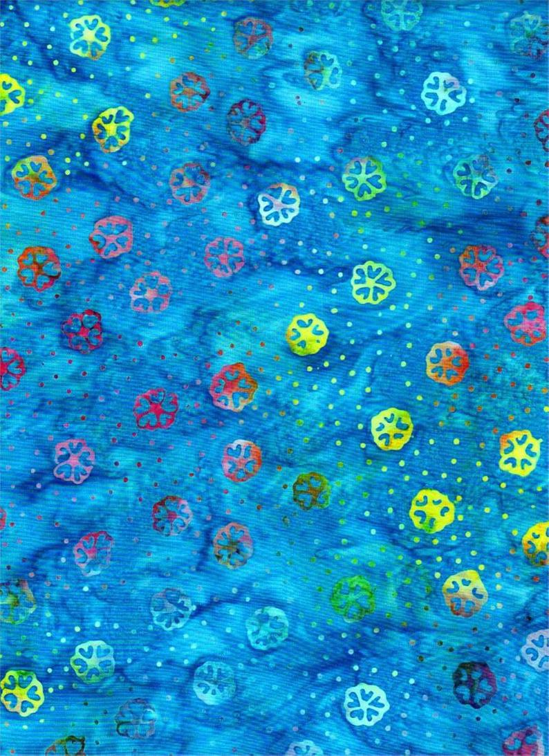 Batik Textiles - 4711 - Deep Sky Blue Rainbow Flowers - Fireworks
1 × $11.80
Batik Textiles - 4711 - Deep Sky Blue Rainbow Flowers - Fireworks
1 × $11.80  Island Batik - IB 422303470 - Purple Leaf Pile - Breezy
1 × $12.60
Island Batik - IB 422303470 - Purple Leaf Pile - Breezy
1 × $12.60 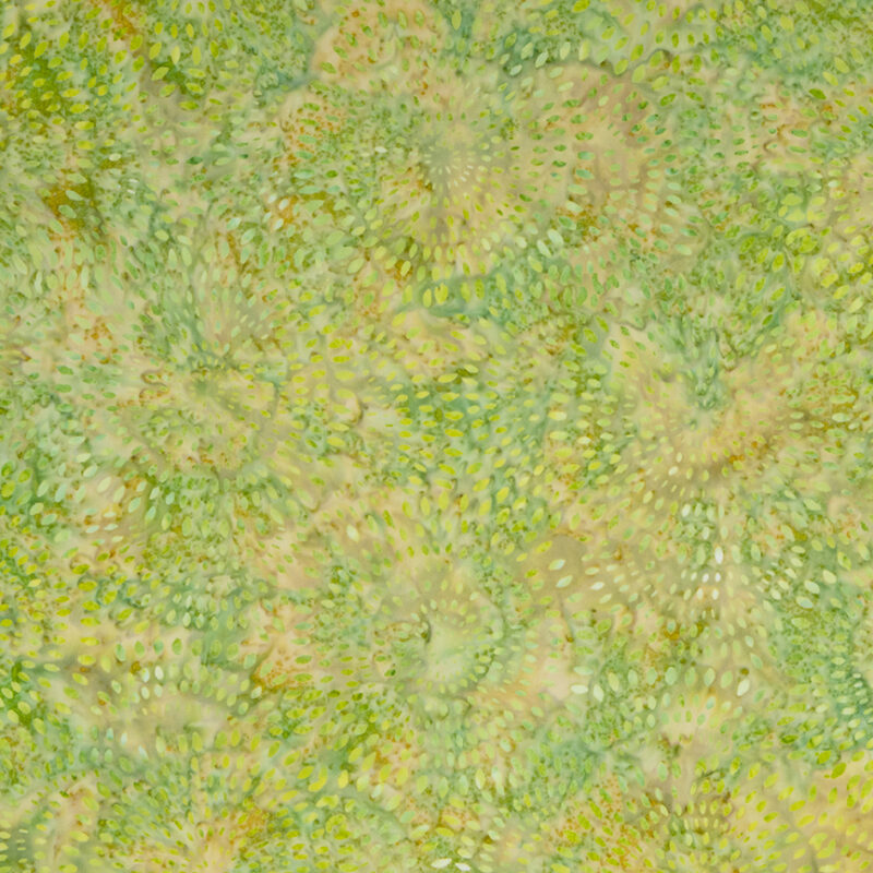 Riley Blake - BTHH1069 Key Lime - Expressions - Batik Fabric
1 × $13.00
Riley Blake - BTHH1069 Key Lime - Expressions - Batik Fabric
1 × $13.00 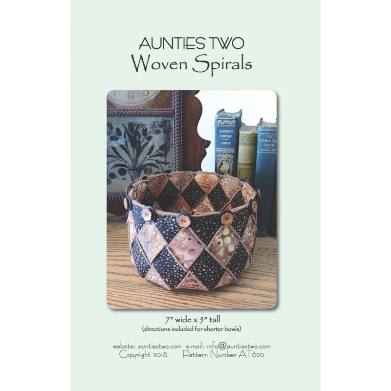 WOVEN SPIRALS Sewing Pattern - Auntie's Two AT620
1 × $9.00
WOVEN SPIRALS Sewing Pattern - Auntie's Two AT620
1 × $9.00 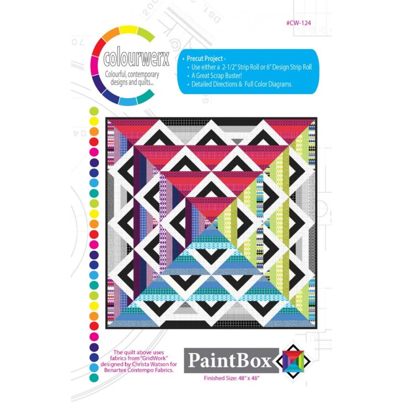 PaintBox Quilt Pattern - Linda & Carl Sullivan - Colourwerx
1 × $11.50
PaintBox Quilt Pattern - Linda & Carl Sullivan - Colourwerx
1 × $11.50 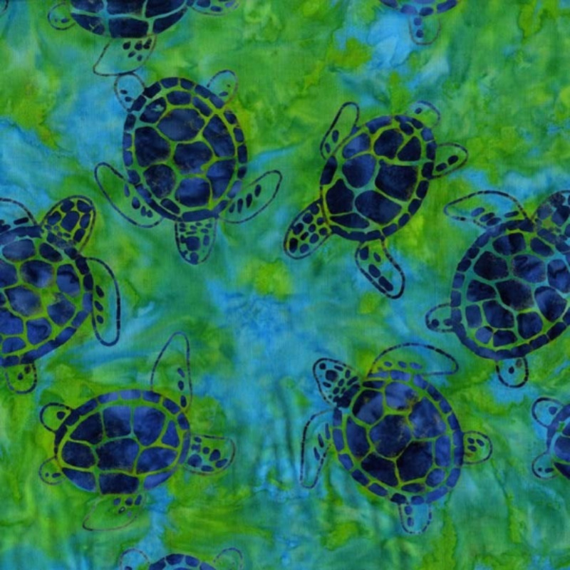 Michael Miller - Sea Turtles Green Blue - BT6392-SEAX-D - Marine Batik Fabric - 25" Remnant
1 × $8.35
Michael Miller - Sea Turtles Green Blue - BT6392-SEAX-D - Marine Batik Fabric - 25" Remnant
1 × $8.35 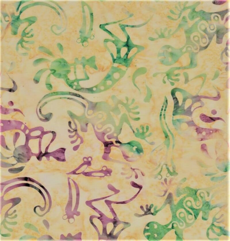 Batik Textiles - 5225 - Cream Kokopelli Lizard - Desert Blooms Fabric
2 × $12.20
Batik Textiles - 5225 - Cream Kokopelli Lizard - Desert Blooms Fabric
2 × $12.20  Island Batik - IB 122012511 - Cloud Snowflake - Glacier Bay
1 × $12.60
Island Batik - IB 122012511 - Cloud Snowflake - Glacier Bay
1 × $12.60 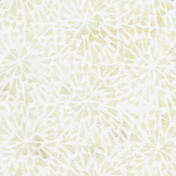 Island Batik - IB 122164003 - Snow Mosaic Burst - Freedom Lights
2 × $12.40
Island Batik - IB 122164003 - Snow Mosaic Burst - Freedom Lights
2 × $12.40 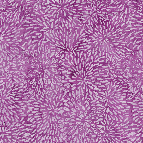 Island Batik - IB 112111475 - Grape Juice Small Petal - Passion Petals
1 × $12.40
Island Batik - IB 112111475 - Grape Juice Small Petal - Passion Petals
1 × $12.40 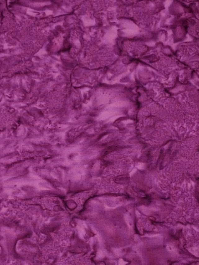 Batik Textiles - 4541 - Magenta Watercolor - Serendipity Blender Fabric
1 × $11.80
Batik Textiles - 4541 - Magenta Watercolor - Serendipity Blender Fabric
1 × $11.80 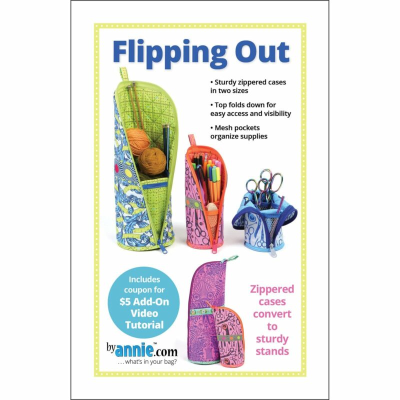 Flipping Out - Sewing Pattern - Byannie.com - Two Sizes - Sturdy Zippered Storage Cases
1 × $9.00
Flipping Out - Sewing Pattern - Byannie.com - Two Sizes - Sturdy Zippered Storage Cases
1 × $9.00 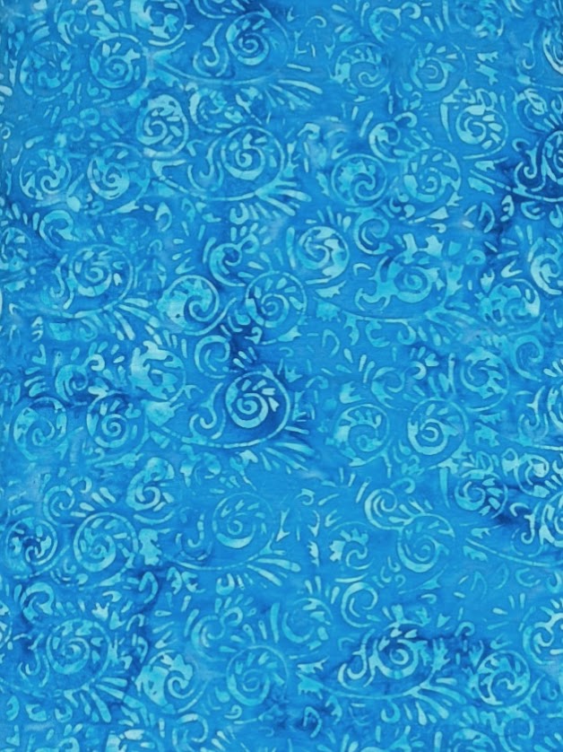 Island Batik - IB BE28-D1 - Waterfall Foulard - Foundations Blenders
1 × $12.40
Island Batik - IB BE28-D1 - Waterfall Foulard - Foundations Blenders
1 × $12.40 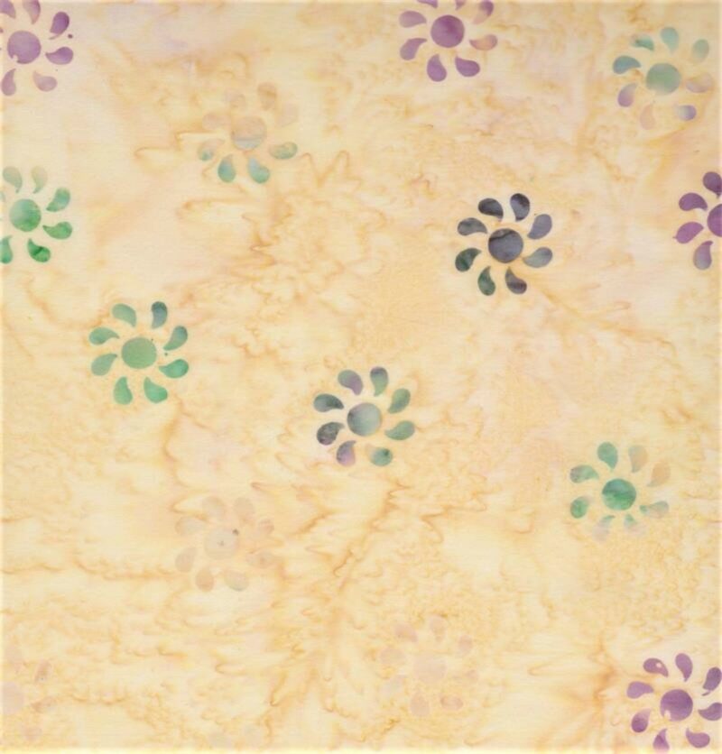 Batik Textiles - 5224 - Cream Kokopelli Flower - Desert Blooms Fabric
1 × $11.80
Batik Textiles - 5224 - Cream Kokopelli Flower - Desert Blooms Fabric
1 × $11.80  Batik Textiles - 6002 - Purple Kokopelli Watercolor Blender - Desert Blooms Fabric
1 × $11.60
Batik Textiles - 6002 - Purple Kokopelli Watercolor Blender - Desert Blooms Fabric
1 × $11.60 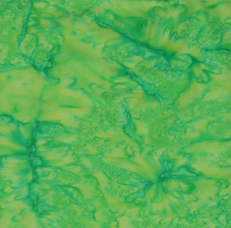 Batik Textiles - 5222 - Green Kokopelli Blender - Desert Blooms Fabric
1 × $11.00
Batik Textiles - 5222 - Green Kokopelli Blender - Desert Blooms Fabric
1 × $11.00 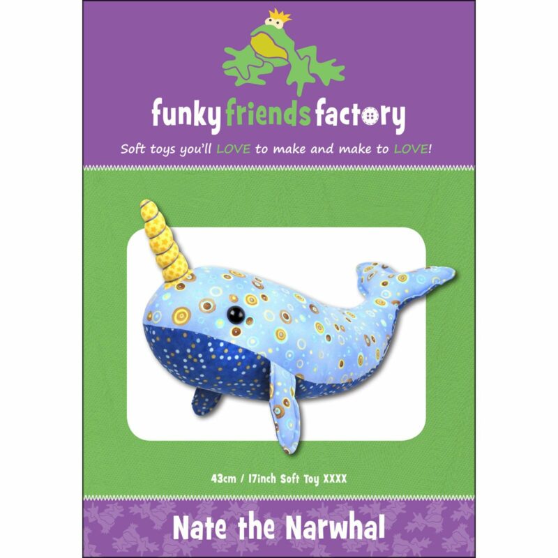 Nate the Narwhal - Stuffed Animal Toy Sewing Pattern - Funky Friends Factory - Cute Adorable Squeeze
1 × $12.00
Nate the Narwhal - Stuffed Animal Toy Sewing Pattern - Funky Friends Factory - Cute Adorable Squeeze
1 × $12.00 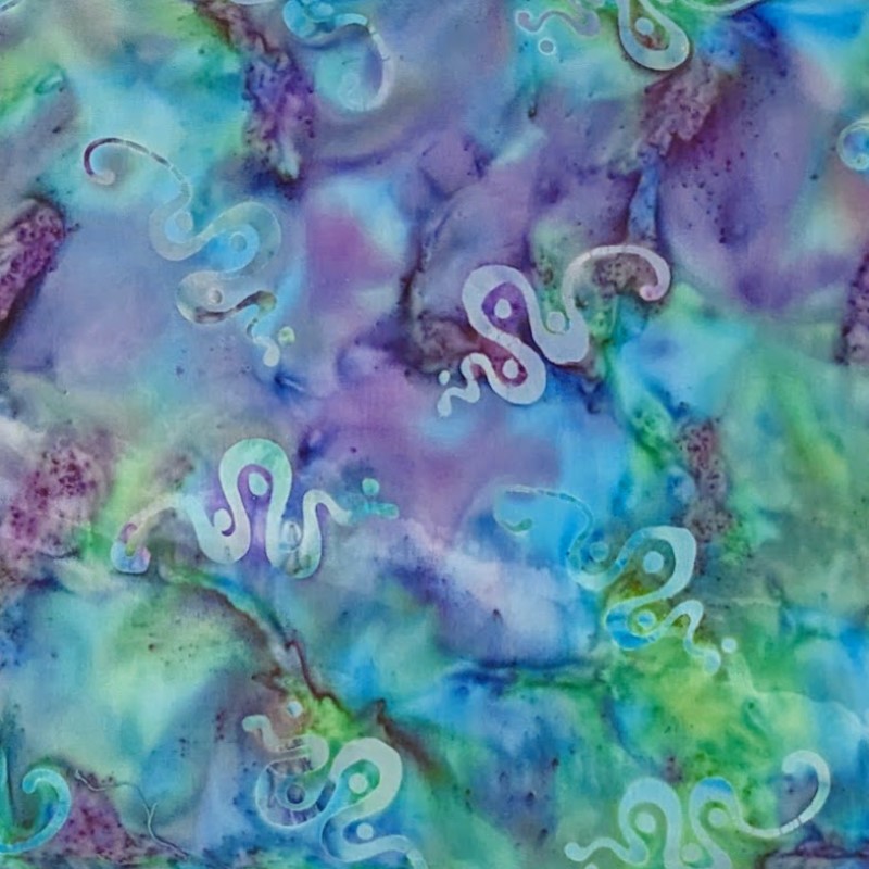 Batik Textiles - 5230 - Blue Green Teal Kokopelli Snake - Desert Blooms Fabric
1 × $11.80
Batik Textiles - 5230 - Blue Green Teal Kokopelli Snake - Desert Blooms Fabric
1 × $11.80 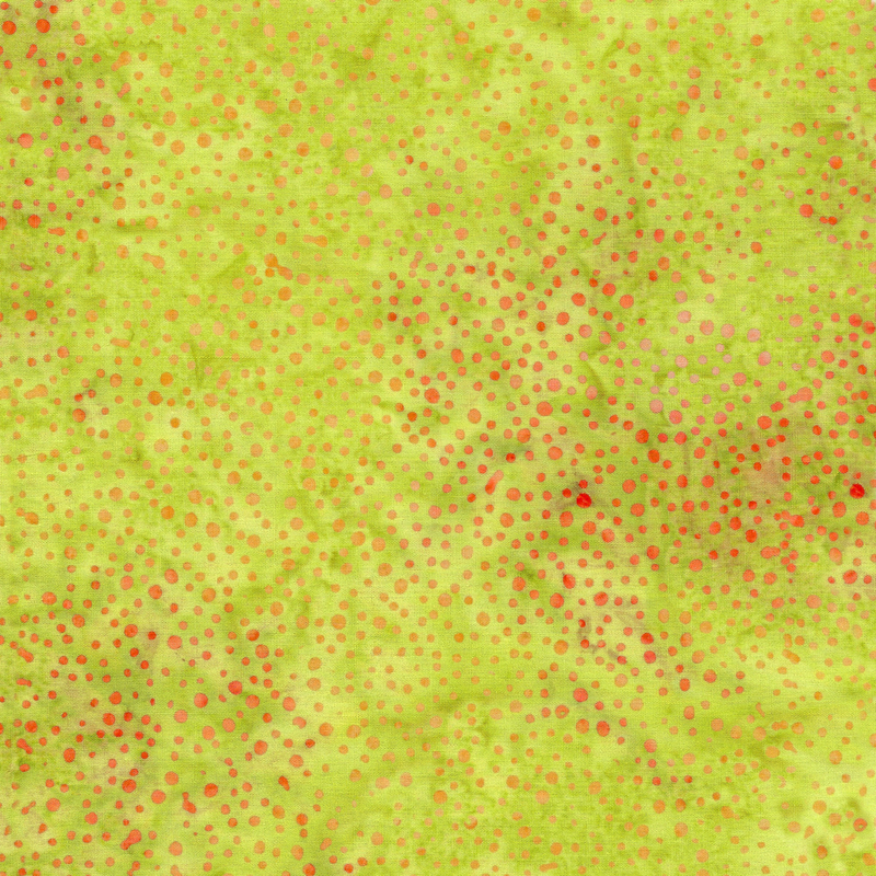 Island Batik - IB 112039640 - Chameleon Dots - Tropicana Twist
1 × $12.00
Island Batik - IB 112039640 - Chameleon Dots - Tropicana Twist
1 × $12.00 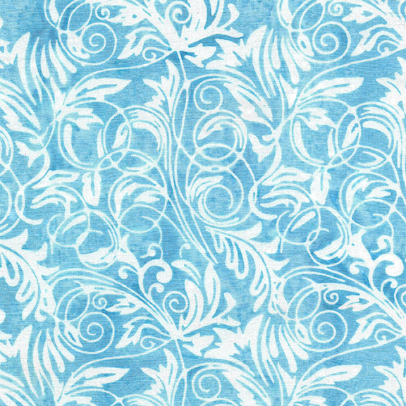 Island Batik - IB 112019515 - Chambray Leaf Tendrils - Buttercup
1 × $12.20
Island Batik - IB 112019515 - Chambray Leaf Tendrils - Buttercup
1 × $12.20 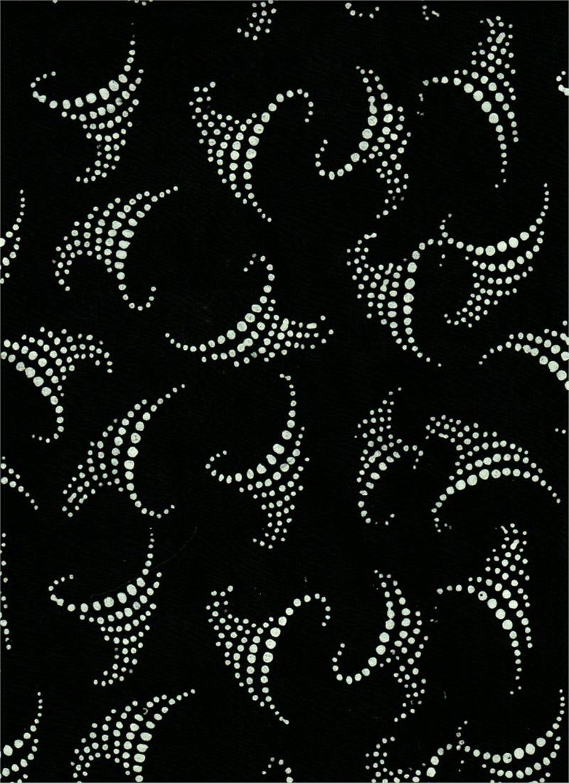 Batik Textiles - 4529 - Black Lt Gray Bubbles - Serendipity Fabric Blender
1 × $11.80
Batik Textiles - 4529 - Black Lt Gray Bubbles - Serendipity Fabric Blender
1 × $11.80 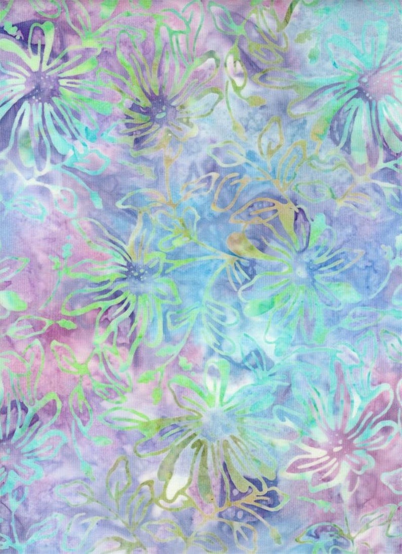 Batik Textiles - 4021 - Blue Purple Pink Flowers - Down Under Fabric
1 × $12.20
Batik Textiles - 4021 - Blue Purple Pink Flowers - Down Under Fabric
1 × $12.20 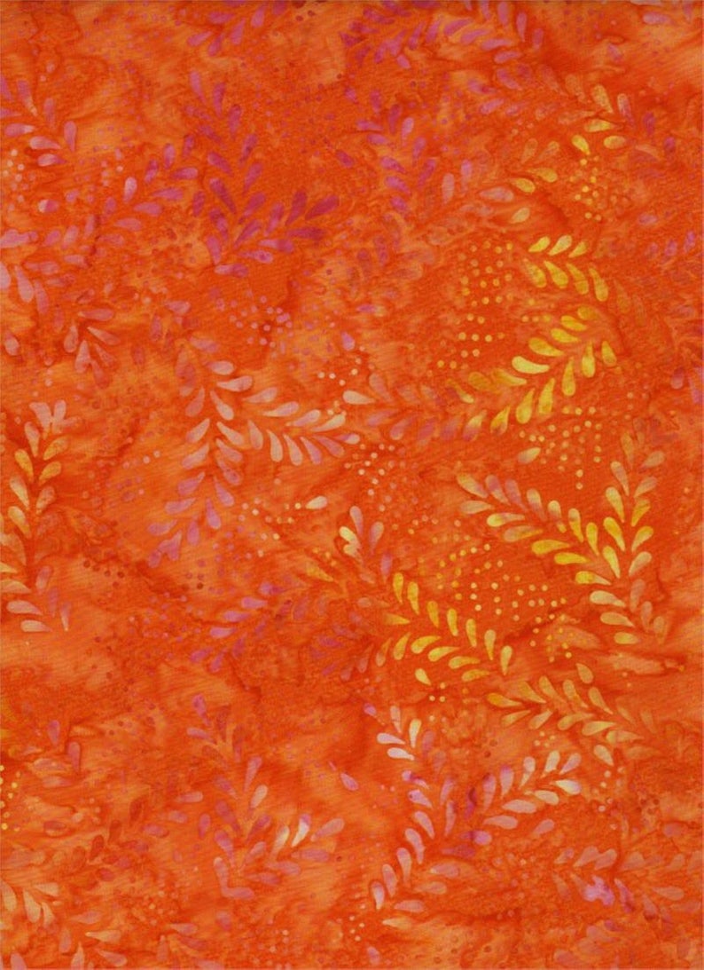 Batik Textiles - 4211 - Bright Orange Leaf - Remnants of Summer Fabric
1 × $11.40
Batik Textiles - 4211 - Bright Orange Leaf - Remnants of Summer Fabric
1 × $11.40 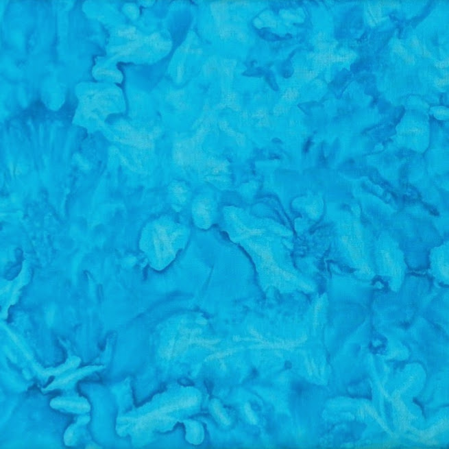 Batik Textiles - 5159 - Blue Kokopelli Watercolor Blender - Desert Blooms Fabric
1 × $10.80
Batik Textiles - 5159 - Blue Kokopelli Watercolor Blender - Desert Blooms Fabric
1 × $10.80 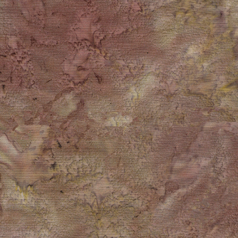 Island Batik - IB Tea - Breathtaking Browns - Foundations Basics Watercolor
2 × $12.40
Island Batik - IB Tea - Breathtaking Browns - Foundations Basics Watercolor
2 × $12.40 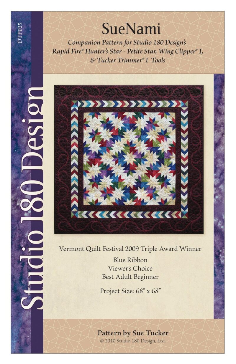 SUE NAMI Quilt Pattern - Sue Tucker - Studio 180 Design
1 × $11.50
SUE NAMI Quilt Pattern - Sue Tucker - Studio 180 Design
1 × $11.50 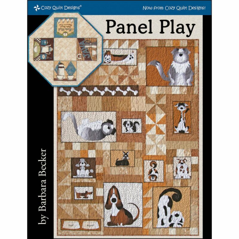 Panel Play Quilt Pattern Booklet - Cozy Quilt Designs - Barbara Becker - Using Panels in Quilts
1 × $16.00
Panel Play Quilt Pattern Booklet - Cozy Quilt Designs - Barbara Becker - Using Panels in Quilts
1 × $16.00 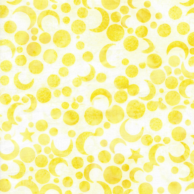 Island Batik - IB 112233200 - Yellow Oatmeal Moon Sun Stars Circle - Baby Bloomers
1 × $12.40
Island Batik - IB 112233200 - Yellow Oatmeal Moon Sun Stars Circle - Baby Bloomers
1 × $12.40 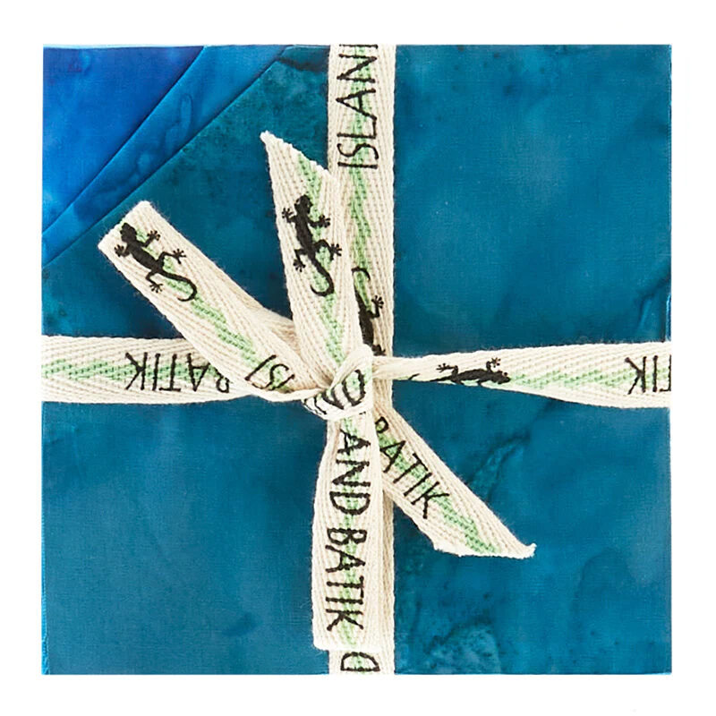 Island Batik - IB 5" Fabric Stamp - Tantalizing Teal - Foundations Basics
2 × $14.00
Island Batik - IB 5" Fabric Stamp - Tantalizing Teal - Foundations Basics
2 × $14.00 Subtotal: $430.95
.
Cart will be automatically cleared after 48 hours of no activity.